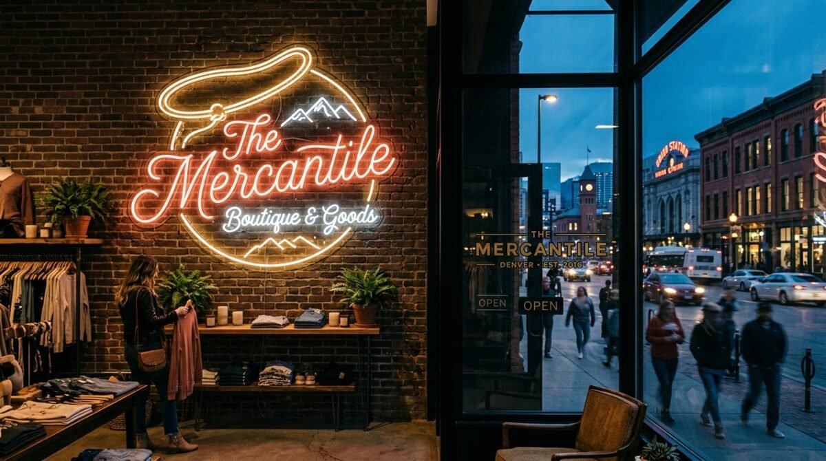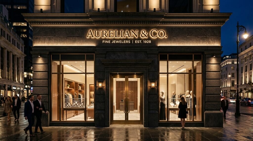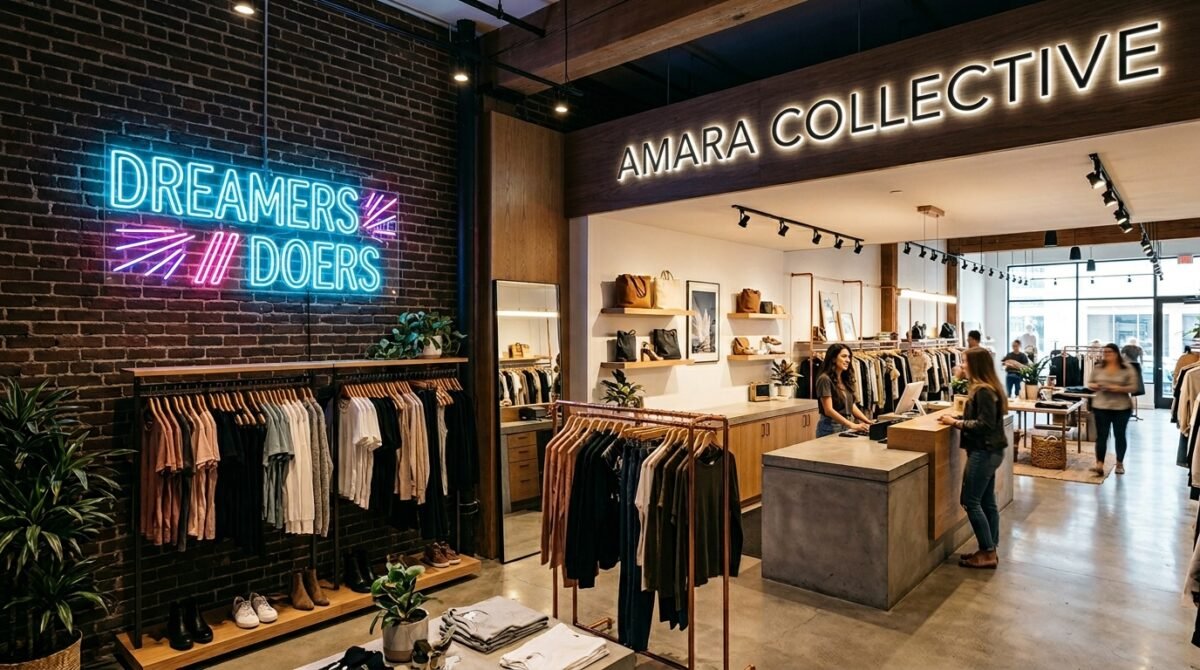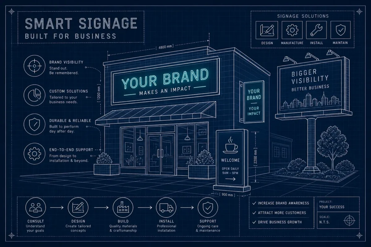
What makes a great business sign design that reflects your brand? Picture two storefronts on the same block. One sign looks like it was made for that business, the colors are right, the type is sharp, and everything about it says exactly what the brand means to say. The other sign looks like something that happened to the building. Same block, probably similar budgets. The difference is intention.
Most business owners feel this distinction instinctively but struggle to put it into words when sitting across from a vendor. They know what they want the sign to feel like, but they don’t always know how to specify the colors, materials, letter weights, and lighting that actually produce that feeling. That gap between brand intuition and vendor brief is where most signage goes sideways.
The businesses that get their business signage design right start with a clear understanding of their visual identity before they ever discuss mounting hardware. When they work with a brand-first partner like Sign and Glow, they see their actual brand in their actual colors on their actual building through a free 3D mockup before a single piece of material is cut. By the end of this article, you’ll have the framework to specify, evaluate, and approve a sign design that reflects your brand, and genuinely represents what your business stands for.
What makes a great business sign design that reflects my brand?
The answer starts before you ever contact a vendor. A sign that reflects your brand requires deliberate decisions across five interconnected areas: logo integration, color and typography accuracy, material and finish selection, lighting type, and system-wide consistency. Each element either reinforces or contradicts your brand identity. Miss one, and the whole system reads as accidental. Get them right together, and your storefront sign design becomes one of the most efficient marketing investments your business makes.
Logo integration: translating your brand mark into a physical sign
The most common starting mistake in sign design is handing a vendor a logo file and assuming the rest works itself out. It doesn’t. A logo designed for a business card or a website behaves completely differently when it’s scaled to three feet wide versus thirty feet wide on a building facade.
How scale changes what your logo communicates
Fine details, thin strokes, and small taglines disappear at sign scale. Simplifying a logo for production is not a compromise of the brand; it’s a prerequisite for logo legibility on signs. The sign version of a logo should always be a cleaner, bolder version of the digital original, because the physics of distance demand it.
What a vendor actually needs from your logo file
A production-ready vendor needs your logo in vector format (PDF, EPS, SVG, or AI), with all text converted to outlines and Pantone Coated color codes specified. Clear space guidelines matter too, because stretching a logo to fill a sign cabinet distorts proportions in ways most business owners don’t catch until the sign is installed.
When 3D and illuminated formats reveal what flat logos hide
A halo-lit logo fabricated in brushed aluminum reads very differently from the same mark printed on a lightbox panel, even when both use identical brand colors. The material and lighting method become part of the brand expression. Both can be on-brand; the key is making the choice deliberately, based on how each finish aligns with the personality your business projects.
Color accuracy and typography: where most branded signage fails
Color is the most emotionally loaded element of any sign, and it’s the element most likely to get lost between brand guidelines and physical fabrication. What looks correct on a calibrated monitor rarely matches powder coat, vinyl, or LED output without deliberate color management.
Matching brand colors from screen to physical material
Pantone Coated (C) color codes are the professional standard for sign fabrication because they give manufacturers a physical reference point that doesn’t shift with screen calibration. HEX codes are useful for digital assets but are a supplementary reference for physical production, Pantone and CMYK remain the fabrication standards. A minimum contrast ratio of 4.5:1 between text and background is the WCAG Level AA baseline for readability under standard conditions; large text may meet the threshold at 3:1, while stricter applications require 7:1. Exceeding that baseline is worth the effort for any exterior sign competing with sunlight and environmental clutter.
Font selection and letter height for real-world readability
The industry rule is one inch of letter height for every ten feet of viewing distance. At fifty feet, that means five-inch minimum letters; at one hundred feet, ten inches. Bold, sans-serif typefaces perform best for sign visibility, Helvetica, Arial, and Open Sans all maintain clarity as distance increases. A brand’s primary typeface sometimes needs to be swapped for a heavier weight variant specifically for signage use, because thin fonts disappear long before a customer is close enough to read them.
Why typography consistency signals brand seriousness
A mismatched font on a sign, even in the correct brand color, creates visual dissonance that customers read as carelessness. Typography inconsistency between a storefront sign and interior signage fragments the customer’s perception of the brand. Inconsistent typography tends to reduce perceived professionalism and erode customer trust, customers don’t articulate this consciously, but they trust the business less.
Materials and finishes that signal brand quality before a word is read
Every material sends a message before a customer processes any text. The texture, weight, and finish of a sign communicate price point, brand personality, and business permanence, often within the first second of visual contact.
What acrylic, metal, and channel letters communicate
Brushed aluminum signals precision and permanence, making it a natural fit for law firms, financial services, and luxury retail. Glossy face-lit acrylic reads as modern and approachable, aligning well with fitness studios, wellness brands, and contemporary retail. Dimensional channel letters communicate an established, professional presence. They’re the format that says this business has been here and intends to stay.
Surface finish and how it reflects on your brand
Matte finishes reduce glare and are commonly perceived by designers as sophisticated. High-gloss finishes catch light and tend to signal energy and boldness. Powder-coated metal in a brand color creates an impression that no generic sign material can replicate. The lifespan tradeoff is also significant for businesses in permanent locations: cast acrylic outdoors holds color for seven to twelve years, while budget vinyl degrades in one to three years. Choosing a material based on its three-year cost instead of its ten-year cost is where most long-term brand investment goes wrong.
Matching material weight to your brand positioning
A luxury boutique and a family diner can both have excellent signs. The material should match the brand’s positioning in the market, not the owner’s personal aesthetic preference or the vendor’s easiest option. A family-friendly restaurant clad in brushed steel sends a mixed signal; a wellness spa in garish backlit vinyl sends an even worse one.
Lighting choices that extend your brand into the night
An unlit sign stops working at dusk. A well-lit sign works harder at night than it does during daylight, because it’s competing with fewer visual distractions. Lighting is a brand design decision, not just a visibility feature.
Face-lit, backlit, and halo-lit: what each says about your brand
Face-lit channel letters, where LED illumination shines through an acrylic face, are bold and high-visibility, ideal for businesses on busy streets that need to be read from 150 feet or more. Backlit lightbox panels create a clean, even glow across a translucent face, which works well for logos with gradients or photographic elements. Halo-lit letters cast illumination behind raised metal lettering, producing a soft, premium glow effect that reads as sophisticated and deliberate. Each option carries a brand personality implication that should match the rest of the brand system.
How light temperature affects perceived color
A warm-white LED shifts a cool-toned brand palette toward yellow. A daylight-temperature LED reads differently against a sign in direct afternoon sun than it does at 8 p.m. Color rendering must be validated under the sign’s actual operating conditions before fabrication is approved. The cost of getting this wrong is not the LED replacement; it’s the ongoing brand impression delivered by a sign that doesn’t match the identity.
LED as the commercial standard in 2026
LED illumination has replaced neon and fluorescent as the default for commercial signage because it delivers lower energy costs, a longer operational lifespan of 50,000 to 100,000 hours, and more precise color control than any predecessor technology. For businesses investing in a permanent location, LED is not a premium option. It’s the baseline.
Brand consistency across every sign your business puts up
A great storefront sign design can still undermine a brand if the interior signage, window graphics, and wayfinding elements use different colors, fonts, or materials. Consistency is what moves a sign from “good-looking” to “trustworthy.”
Exterior to interior signage: maintaining a unified visual identity
Customers who walk through your door after seeing the storefront sign are already forming an impression. If the interior typeface is slightly different, or the color on the reception sign is an off-brand approximation, that impression fragments immediately. The touchpoints that need to align include the entry sign, directional signage, menu boards or product displays, and even restroom identifiers. Every sign is a brand touchpoint.
Wayfinding and secondary signage as brand ambassadors
Wayfinding signs are treated as functional afterthoughts in most businesses, and that’s a strategic error. A well-designed door sign or tenant directory, executed in the same material language as the primary sign, reinforces brand credibility at every interaction point. Customers experience consistency as competence. The inverse is equally true, inconsistency reads as carelessness, regardless of the quality of the product behind the door.
Why visual inconsistency costs more than a rebrand
Inconsistency across a brand’s sign system creates real costs: customer confusion, reduced perceived professionalism, and the inevitable expense of replacing mismatched signs when the business finally standardizes. Working with a single vendor capable of handling both exterior and interior signage, like Sign and Glow, often reduces the risk of inconsistent materials and repeated replacement by building a unified sign system from the start.
How to brief a sign vendor and why the 3D mockup changes everything
The framework above is only useful if it translates into a clear vendor brief. A strong sign specification covers six elements that any capable vendor needs before beginning design.
The six-point sign specification brief
Before contacting a vendor, gather the following:
- Brand color codes in Pantone Coated and CMYK formats for fabrication, plus HEX as a supplementary digital reference
- Logo file in vector format with fonts outlined
- Preferred material and surface finish
- Illumination type (face-lit, halo-lit, backlit panel, or unlit)
- Mounting surface dimensions and substrate type
- Viewing distance from the street or pedestrian path
These six elements give a vendor everything they need to produce an on-brand proposal rather than a generic approximation. Showing up without them is how you end up with a sign that looks like it could belong to any business on the block.
How Sign and Glow’s brand-first process eliminates guesswork
Sign and Glow’s process starts on day one with a brand-first design consultation, followed by a free 3D mockup that shows your sign in its actual environment before any fabrication decision is locked in. You review the colors, the letter weight, the material finish, and the scale, then give feedback or approve. Production only begins when the mockup is exactly right, so you can evaluate what your business signage design will look like before committing to fabrication.
How to evaluate any vendor’s proposal: a five-point checklist
Before approving any sign vendor’s proposal, get clear answers to these five questions:
- Does the mockup show accurate brand colors matched to your Pantone specs?
- Is the specified material listed with an expected outdoor lifespan?
- Is the font rendered at the correct weight for the proposed letter height and viewing distance?
- Is the illumination type confirmed in writing with a specific LED specification?
- Is there a dedicated project manager assigned to your order, responsible for communication from brief through delivery?
If a vendor can’t answer all five clearly, the proposal isn’t ready to approve.
A sign design that reflects your brand is never accidental
Every element covered in this article, logo integration, color and typography accuracy, material and finish selection, lighting type, system-wide consistency, and a clear vendor brief, contributes to a sign design that reflects your brand rather than a generic commercial presence. None of it requires an unlimited budget. All of it requires intention.
The businesses with the most recognizable signage, the ones where the sign looks like it was made specifically for that location and no other, started by knowing exactly what their brand needed to say before they ever talked about materials or mounting hardware. They briefed clearly, asked the right questions, and validated their choices before committing to fabrication.
If you know what your brand stands for, Sign and Glow’s brand-first consultation and free 3D mockup process gives you a direct path to seeing that identity translated into a physical sign before you commit a single dollar to production. See what makes a great business sign design that reflects your brand, request your free 3D mockup today. Your sign is often the first thing a customer ever sees about your business. Make sure it says exactly what you intend.