Anecdotally, many business owners spend days selecting a logo color and five minutes picking a sign font, then wonder why foot traffic doesn’t improve after a new sign goes up. The question of what fonts and colors work best for business signs isn’t a matter of personal taste, it has concrete, research-backed answers rooted in human vision science and decades of field-tested signage design. This guide covers font selection, color contrast, distance scaling, brand color translation, and the most common errors that undermine an otherwise solid sign. At Sign and Glow, every custom sign project begins with a brand-first design consultation precisely because these decisions carry real commercial stakes. By the end of this article, you’ll have a clear framework to evaluate any sign choice with confidence.
Why your sign font is the first thing customers judge
Before a customer reads a single word on your sign, their visual system has already pre-filtered it. Fonts with clean, uniform strokes register at distance; fonts with decorative details turn into visual noise before the brain can extract meaning. Initial impressions form very quickly, often before conscious attention kicks in, and customers who can’t read a sign in a single glance rarely circle back to try again.
Sans-serif fonts dominate outdoor legibility research
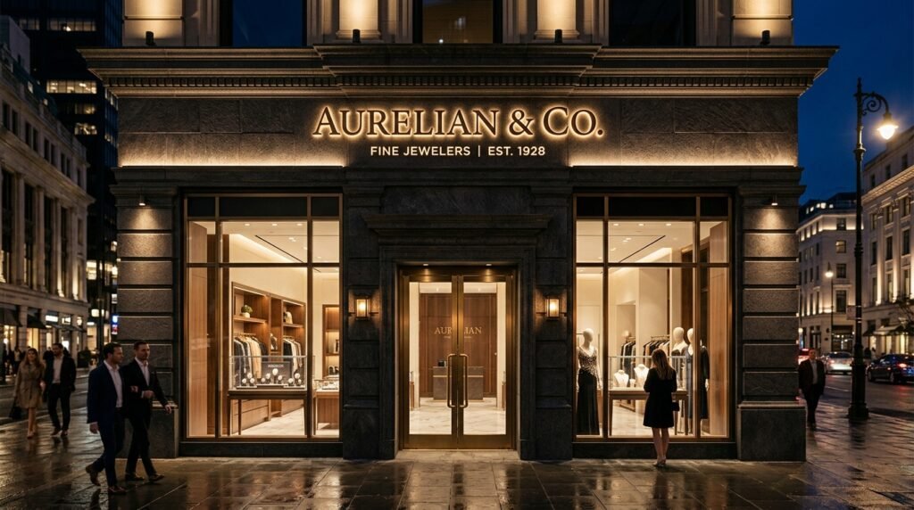
Sans-serif typefaces consistently outperform every other category for storefront and roadside signs. Clean, undecorated strokes remain visually distinct at 30, 50, and 200 feet, while serifs and ornate details merge into blur at the same distances. The proven performers are Helvetica, Gotham, Montserrat, Frutiger, Futura, and Open Sans. Helvetica is the most extensively studied option; field testing consistently shows it outperforms ornate alternatives by a wide margin, documented comparisons show readability gains approaching 30% under controlled distance conditions. Treat this as your first filter when deciding what fonts and colors work best for business signs: if a font isn’t a bold sans-serif, it needs a strong justification to appear on primary sign copy.
Bold weight and x-height: what those terms mean in practice
X-height refers to the height of lowercase letters relative to uppercase letters in a typeface. A high x-height means lowercase letters are proportionally taller, which makes them more readable when a sign is viewed from a distance or at an angle. Font weight compounds this effect: a Bold or Heavy variant of any legible font outperforms its Regular counterpart, especially on signs that face direct sun or age outdoors over time. When selecting a typeface for a storefront sign, choose Bold or Heavy by default and treat Regular weight as an option only for secondary or supplemental text.
Sign font size guidelines: scaling for real-world viewing distances
The most technically correct font choice will still fail if the letters are sized wrong for the distance at which your customers will first read the sign. Sizing for viewing distance is where most DIY sign decisions break down, and it’s the reason a sign that looks perfect in a design file reads as a blur from a passing car.
The 1-inch-per-10-feet rule explained
The industry-standard formula is straightforward: one inch of letter height for every 10 feet of viewing distance. At 10 feet, the minimum is one inch; at 50 feet, five to seven inches; at 200 feet, 20 to 24 inches. For high-traffic or fast-moving environments such as roadside signs or drive-throughs, double the height (two inches per 10 feet) to guarantee faster recognition. For designers working in software, multiply the target inch height by 72 to get the equivalent point size: a five-inch letter equals 360 points.
How stroke width and letter spacing must scale with size
Letter height gets most of the attention, but stroke width and spacing are equally critical. Stroke width should stay between one-fifth and one-sixth of the letter height; any thinner and strokes vanish at distance, particularly on aged or weathered signs.
Letter spacing (tracking) should increase as viewing distance grows. Use 10 to 15% of letter height at close range and step up to 15 to 20% at 50 feet or beyond. Wider spacing prevents characters from visually merging before the reader’s eye can separate them. Word spacing should equal at least the width of a capital “O” so individual words remain distinguishable from a distance without conscious effort from the reader.
High-contrast color pairs for signs: what holds up outdoors
Color is where sign decisions often become subjective when they absolutely shouldn’t be. The combinations that produce the highest legibility in outdoor conditions are well-documented, and the gaps between the top performers and the failures are significant enough to measure in lost customer attention. Choosing the right pairing is central to understanding what fonts and colors work best for business signs.
The six pairings with the highest outdoor legibility
Each of the following pairings serves a specific role, and treating them as interchangeable is a mistake. Black on yellow registers one of the highest measured luminance contrasts in human vision research, approximately 19.56:1 by WCAG luminance calculations, and belongs on urgent calls to action. (Pure white on black can yield an even higher ratio near 21:1, making it the absolute ceiling for contrast.) Black on white and white on black are the reliable standards for informational and regulatory content. White on blue signals trust and is the backbone of highway guide signage worldwide. Yellow on black offers the same high contrast ratio as black on yellow with a different visual character suited to premium-tier brands. Red on white grabs immediate attention for promotional content but may become visually tiring if applied as a primary sign color across an entire frontage.
The 70% brightness differential rule you can’t ignore
If the brightness difference between your text color and background is less than 70%, legibility cannot be reliably guaranteed in field conditions. The professional benchmark, drawn from industry standards and signage best practices, is a 75 LRV (light reflectance value) gap between foreground and background: convert both colors to grayscale and check for an obvious light-to-dark difference. If they look similar in grayscale, they’ll fail at 30 feet in daylight. The digital standards increasingly applied to physical signage are a 4.5:1 contrast ratio for normal-sized text and 3:1 for large display text; both are worth checking during the design phase even for non-digital signs.
Applying your brand colors without sacrificing readability
Brand color preservation is the tension point where most business owners push back on professional sign guidance, and understandably so. The brand palette represents real investment and recognition equity. The good news is that most brand colors translate into signage with the right approach; the cases where adaptation is necessary are predictable and manageable.
When your brand palette translates directly to a sign
A dark primary brand color paired against a white or near-white background, or a white wordmark on a richly saturated dark brand color, typically meets the 70% brightness differential without any modification. Run the grayscale self-test: convert both your text color and your background color to grayscale and look for an obvious contrast difference. If text and background look similar in grayscale, they’ll fail at 30 feet in daylight regardless of how vibrant they appear on screen. Many brand palettes pass this test without any adjustment at all.
When adaptation is necessary, and how to do it right
The common tension point is a brand signature color that sits in the mid-tone range, meaning it lacks sufficient contrast against both white and black backgrounds. Two practical solutions resolve this without abandoning the brand identity. First, shift the brand hue moderately darker or lighter while staying within the same color family; the color relationship remains recognizable even when the exact value changes. Second, introduce a high-contrast neutral (white, off-white, or charcoal) as the background and let the brand color own the lettering or border treatment. This is the kind of color translation problem Sign and Glow’s brand-first consultation is built to solve, ensuring the palette survives fabrication without losing storefront impact.
Fonts and color treatments that kill sign visibility
Every category listed below appears on real commercial signs in real markets right now, and every one of them is reducing the business’s visible reach. Knowing what to eliminate is as actionable as knowing what fonts and colors work best for business signs.
Font categories to cut from your shortlist immediately
Five categories consistently fail on primary sign copy and reduce legibility at distance:
- Script and handwriting fonts become illegible beyond five to six feet.
- Decorative and novelty fonts reduce legibility at distance and distract from the message rather than delivering it.
- Ultra-thin or light-weight typefaces lose their strokes outdoors, especially in bright sun or against a bright background.
- Condensed or narrow typefaces cause letters to merge at viewing distance.
- Highly decorative serif fonts blur under real-world conditions where ambient light, angle, and distance all work against fine detail.
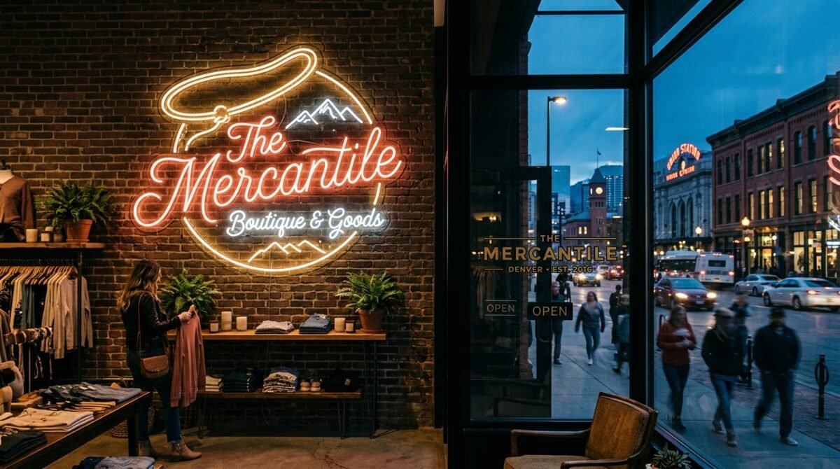
Script elements in a logo can stay in the logo. Primary signage copy should always pair a script logo with a clear, bold sans-serif for the main message text.
Color pairings that reduce legibility in the field
Red on black and dark green on black both fail due to insufficient value difference between the two colors. Red text on a blue background creates visual vibration that forces the eye to work harder than any storefront sign should demand. Pastel-on-light combinations disappear entirely in bright midday sun. Red-on-green pairings are inaccessible to a significant portion of colorblind viewers and should be avoided in any public-facing sign context. Finally, all-capitals body copy slows reading speed by roughly 10 to 20% compared to mixed-case text due to reduced word-shape recognition; reserve all-caps for short, high-impact single words where the trade-off is worth it.
Contrast and accessibility requirements for commercial signage
ADA compliance for business signs is often misunderstood as applying only to large commercial buildings or government facilities. In practice, any permanent room identification sign in a U.S. commercial building must meet specific standards, and the visual contrast requirements apply more broadly than most business owners realize.
ADA contrast requirements in plain terms
The ADA Standards for Accessible Design do not prescribe a specific numerical contrast ratio. They require “high contrast,” defined as light characters on a dark background or dark characters on a light background, on a non-glare surface. In practice, the professional benchmark that satisfies this requirement is a 70% brightness differential or a 75 LRV gap between text and background. Permanent room identification signs (restrooms, exits, stairwells) must also include raised tactile characters sized between 5/8 inch and 2 inches in height, accompanied by Grade 2 Braille. These tactile requirements do not apply to directional or wayfinding signs, but visual contrast and character sizing standards still apply to both.
Non-glare finish, mounting specs, and what wayfinding signs must do
A gloss or reflective face finish can make a technically high-contrast sign illegible for low-vision users because of light bounce off the surface. Matte or satin finishes are the standard recommendation for any sign where ADA compliance or broad accessibility is a consideration. For permanent room identification signs, the ADA specifies a mounting height range of 48 to 60 inches from the floor to the baseline of the lowest tactile character. Wayfinding and directional signs don’t require tactile characters, but visual character height must still scale to the distance at which a person will first encounter the sign, following the same one-inch-per-10-feet principle that governs all legible signage.
Putting the framework to work
The best fonts and colors for business signs aren’t subjective choices that come down to preference. They follow a set of proven principles around legibility, contrast, and viewing distance that apply regardless of industry, brand personality, or budget. The core decision chain is consistent: start with a bold sans-serif typeface, confirm your color pair clears the 70% brightness differential, scale letter height to the actual distance at which your customers will first read the sign, eliminate anything thin, scripted, or low-contrast from primary copy, and verify ADA requirements for any permanent interior room identification signs.
Brand color doesn’t have to be abandoned to achieve a legible, high-impact sign. It has to be applied correctly, with the right contrast relationships and the right material finish to perform in real outdoor and indoor conditions. These principles give you a decision framework that holds regardless of brand, budget, or building type, and a partner like Sign and Glow gives you the fabrication quality to make those design decisions count at the storefront level.