signandglow.com

Categories
Blog

Best Fonts and Colors for Business Signs That Get Noticed

Anecdotally, many business owners spend days selecting a logo color and five minutes picking a sign font, then wonder why foot traffic doesn’t improve after a new sign goes up. The question of what fonts and colors work best for business signs isn’t a matter of personal taste, it has concrete, research-backed answers rooted in human vision science and decades of field-tested signage design. This guide covers font selection, color contrast, distance scaling, brand color translation, and the most common errors that undermine an otherwise solid sign. At Sign and Glow, every custom sign project begins with a brand-first design consultation precisely because these decisions carry real commercial stakes. By the end of this article, you’ll have a clear framework to evaluate any sign choice with confidence.

Why your sign font is the first thing customers judge

Before a customer reads a single word on your sign, their visual system has already pre-filtered it. Fonts with clean, uniform strokes register at distance; fonts with decorative details turn into visual noise before the brain can extract meaning. Initial impressions form very quickly, often before conscious attention kicks in, and customers who can’t read a sign in a single glance rarely circle back to try again.

Sans-serif fonts dominate outdoor legibility research

Sans-serif typefaces consistently outperform every other category for storefront and roadside signs. Clean, undecorated strokes remain visually distinct at 30, 50, and 200 feet, while serifs and ornate details merge into blur at the same distances. The proven performers are Helvetica, Gotham, Montserrat, Frutiger, Futura, and Open Sans. Helvetica is the most extensively studied option; field testing consistently shows it outperforms ornate alternatives by a wide margin, documented comparisons show readability gains approaching 30% under controlled distance conditions. Treat this as your first filter when deciding what fonts and colors work best for business signs: if a font isn’t a bold sans-serif, it needs a strong justification to appear on primary sign copy.

Bold weight and x-height: what those terms mean in practice

X-height refers to the height of lowercase letters relative to uppercase letters in a typeface. A high x-height means lowercase letters are proportionally taller, which makes them more readable when a sign is viewed from a distance or at an angle. Font weight compounds this effect: a Bold or Heavy variant of any legible font outperforms its Regular counterpart, especially on signs that face direct sun or age outdoors over time. When selecting a typeface for a storefront sign, choose Bold or Heavy by default and treat Regular weight as an option only for secondary or supplemental text.

Sign font size guidelines: scaling for real-world viewing distances

The most technically correct font choice will still fail if the letters are sized wrong for the distance at which your customers will first read the sign. Sizing for viewing distance is where most DIY sign decisions break down, and it’s the reason a sign that looks perfect in a design file reads as a blur from a passing car.

The 1-inch-per-10-feet rule explained

The industry-standard formula is straightforward: one inch of letter height for every 10 feet of viewing distance. At 10 feet, the minimum is one inch; at 50 feet, five to seven inches; at 200 feet, 20 to 24 inches. For high-traffic or fast-moving environments such as roadside signs or drive-throughs, double the height (two inches per 10 feet) to guarantee faster recognition. For designers working in software, multiply the target inch height by 72 to get the equivalent point size: a five-inch letter equals 360 points.

How stroke width and letter spacing must scale with size

Letter height gets most of the attention, but stroke width and spacing are equally critical. Stroke width should stay between one-fifth and one-sixth of the letter height; any thinner and strokes vanish at distance, particularly on aged or weathered signs.

Letter spacing (tracking) should increase as viewing distance grows. Use 10 to 15% of letter height at close range and step up to 15 to 20% at 50 feet or beyond. Wider spacing prevents characters from visually merging before the reader’s eye can separate them. Word spacing should equal at least the width of a capital “O” so individual words remain distinguishable from a distance without conscious effort from the reader.

High-contrast color pairs for signs: what holds up outdoors

Color is where sign decisions often become subjective when they absolutely shouldn’t be. The combinations that produce the highest legibility in outdoor conditions are well-documented, and the gaps between the top performers and the failures are significant enough to measure in lost customer attention. Choosing the right pairing is central to understanding what fonts and colors work best for business signs.

The six pairings with the highest outdoor legibility

Each of the following pairings serves a specific role, and treating them as interchangeable is a mistake. Black on yellow registers one of the highest measured luminance contrasts in human vision research, approximately 19.56:1 by WCAG luminance calculations, and belongs on urgent calls to action. (Pure white on black can yield an even higher ratio near 21:1, making it the absolute ceiling for contrast.) Black on white and white on black are the reliable standards for informational and regulatory content. White on blue signals trust and is the backbone of highway guide signage worldwide. Yellow on black offers the same high contrast ratio as black on yellow with a different visual character suited to premium-tier brands. Red on white grabs immediate attention for promotional content but may become visually tiring if applied as a primary sign color across an entire frontage.

The 70% brightness differential rule you can’t ignore

If the brightness difference between your text color and background is less than 70%, legibility cannot be reliably guaranteed in field conditions. The professional benchmark, drawn from industry standards and signage best practices, is a 75 LRV (light reflectance value) gap between foreground and background: convert both colors to grayscale and check for an obvious light-to-dark difference. If they look similar in grayscale, they’ll fail at 30 feet in daylight. The digital standards increasingly applied to physical signage are a 4.5:1 contrast ratio for normal-sized text and 3:1 for large display text; both are worth checking during the design phase even for non-digital signs.

Applying your brand colors without sacrificing readability

Brand color preservation is the tension point where most business owners push back on professional sign guidance, and understandably so. The brand palette represents real investment and recognition equity. The good news is that most brand colors translate into signage with the right approach; the cases where adaptation is necessary are predictable and manageable.

When your brand palette translates directly to a sign

A dark primary brand color paired against a white or near-white background, or a white wordmark on a richly saturated dark brand color, typically meets the 70% brightness differential without any modification. Run the grayscale self-test: convert both your text color and your background color to grayscale and look for an obvious contrast difference. If text and background look similar in grayscale, they’ll fail at 30 feet in daylight regardless of how vibrant they appear on screen. Many brand palettes pass this test without any adjustment at all.

When adaptation is necessary, and how to do it right

The common tension point is a brand signature color that sits in the mid-tone range, meaning it lacks sufficient contrast against both white and black backgrounds. Two practical solutions resolve this without abandoning the brand identity. First, shift the brand hue moderately darker or lighter while staying within the same color family; the color relationship remains recognizable even when the exact value changes. Second, introduce a high-contrast neutral (white, off-white, or charcoal) as the background and let the brand color own the lettering or border treatment. This is the kind of color translation problem Sign and Glow’s brand-first consultation is built to solve, ensuring the palette survives fabrication without losing storefront impact.

Fonts and color treatments that kill sign visibility

Every category listed below appears on real commercial signs in real markets right now, and every one of them is reducing the business’s visible reach. Knowing what to eliminate is as actionable as knowing what fonts and colors work best for business signs.

Font categories to cut from your shortlist immediately

Five categories consistently fail on primary sign copy and reduce legibility at distance:

  • Script and handwriting fonts become illegible beyond five to six feet.
  • Decorative and novelty fonts reduce legibility at distance and distract from the message rather than delivering it.
  • Ultra-thin or light-weight typefaces lose their strokes outdoors, especially in bright sun or against a bright background.
  • Condensed or narrow typefaces cause letters to merge at viewing distance.
  • Highly decorative serif fonts blur under real-world conditions where ambient light, angle, and distance all work against fine detail.

Script elements in a logo can stay in the logo. Primary signage copy should always pair a script logo with a clear, bold sans-serif for the main message text.

Color pairings that reduce legibility in the field

Red on black and dark green on black both fail due to insufficient value difference between the two colors. Red text on a blue background creates visual vibration that forces the eye to work harder than any storefront sign should demand. Pastel-on-light combinations disappear entirely in bright midday sun. Red-on-green pairings are inaccessible to a significant portion of colorblind viewers and should be avoided in any public-facing sign context. Finally, all-capitals body copy slows reading speed by roughly 10 to 20% compared to mixed-case text due to reduced word-shape recognition; reserve all-caps for short, high-impact single words where the trade-off is worth it.

Contrast and accessibility requirements for commercial signage

ADA compliance for business signs is often misunderstood as applying only to large commercial buildings or government facilities. In practice, any permanent room identification sign in a U.S. commercial building must meet specific standards, and the visual contrast requirements apply more broadly than most business owners realize.

ADA contrast requirements in plain terms

The ADA Standards for Accessible Design do not prescribe a specific numerical contrast ratio. They require “high contrast,” defined as light characters on a dark background or dark characters on a light background, on a non-glare surface. In practice, the professional benchmark that satisfies this requirement is a 70% brightness differential or a 75 LRV gap between text and background. Permanent room identification signs (restrooms, exits, stairwells) must also include raised tactile characters sized between 5/8 inch and 2 inches in height, accompanied by Grade 2 Braille. These tactile requirements do not apply to directional or wayfinding signs, but visual contrast and character sizing standards still apply to both.

Non-glare finish, mounting specs, and what wayfinding signs must do

A gloss or reflective face finish can make a technically high-contrast sign illegible for low-vision users because of light bounce off the surface. Matte or satin finishes are the standard recommendation for any sign where ADA compliance or broad accessibility is a consideration. For permanent room identification signs, the ADA specifies a mounting height range of 48 to 60 inches from the floor to the baseline of the lowest tactile character. Wayfinding and directional signs don’t require tactile characters, but visual character height must still scale to the distance at which a person will first encounter the sign, following the same one-inch-per-10-feet principle that governs all legible signage.

Putting the framework to work

The best fonts and colors for business signs aren’t subjective choices that come down to preference. They follow a set of proven principles around legibility, contrast, and viewing distance that apply regardless of industry, brand personality, or budget. The core decision chain is consistent: start with a bold sans-serif typeface, confirm your color pair clears the 70% brightness differential, scale letter height to the actual distance at which your customers will first read the sign, eliminate anything thin, scripted, or low-contrast from primary copy, and verify ADA requirements for any permanent interior room identification signs.

Brand color doesn’t have to be abandoned to achieve a legible, high-impact sign. It has to be applied correctly, with the right contrast relationships and the right material finish to perform in real outdoor and indoor conditions. These principles give you a decision framework that holds regardless of brand, budget, or building type, and a partner like Sign and Glow gives you the fabrication quality to make those design decisions count at the storefront level.
Categories
Blog

Acrylic vs Metal Business Signs: Pros, Cons, and Best Uses

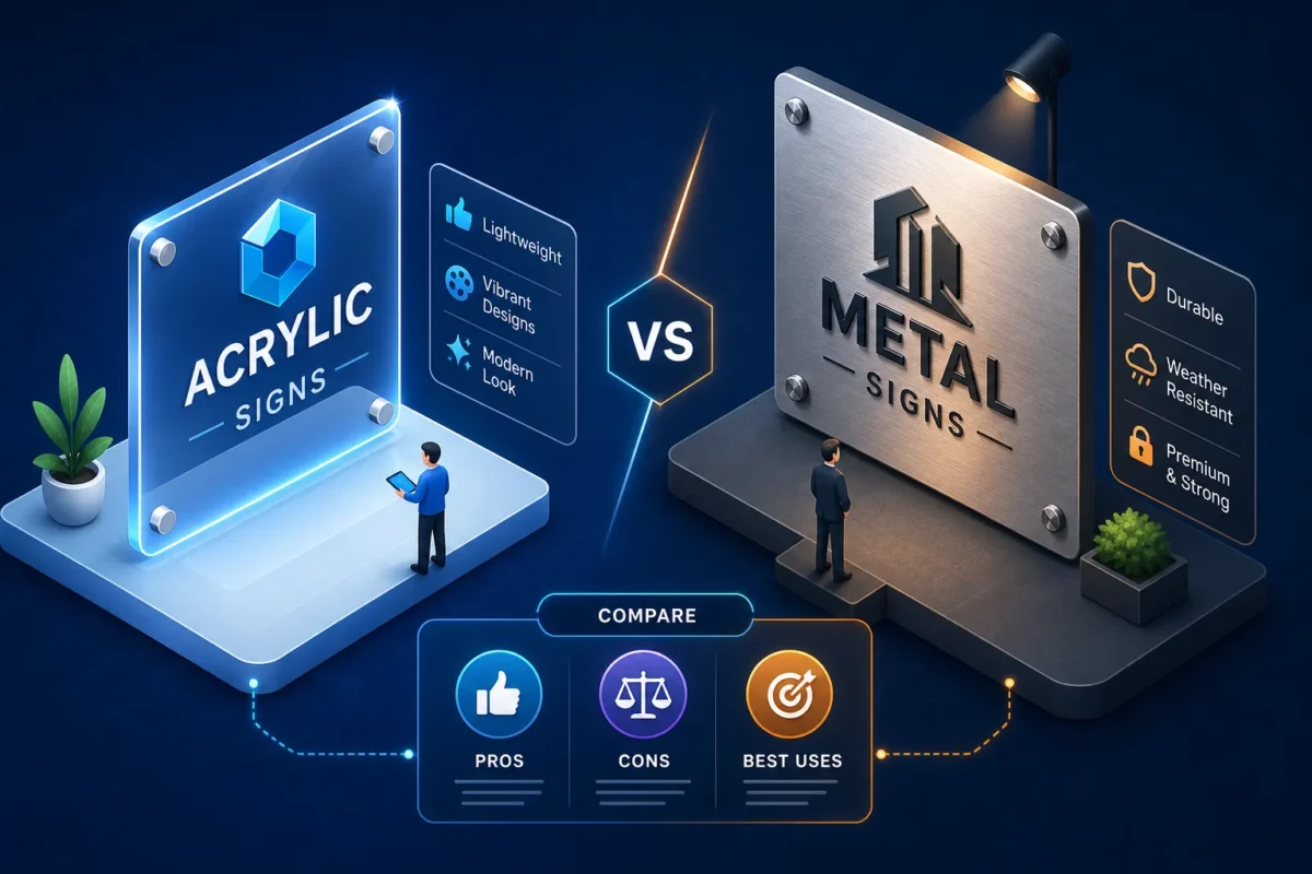
When comparing acrylic signs vs metal signs for business, the right material depends on where your sign will live, how long you need it to last, and what your brand needs to communicate visually. You’re getting quotes for a new storefront sign, and two material options keep coming up, acrylic and metal. Both look sharp in photos. Both come in custom sizes. And nobody at the sign shop is giving you a straight answer on which one actually fits your brand, your building, and your budget.

At Sign and Glow, we fabricate both materials daily for businesses across the U.S., and this question comes up on almost every project. The honest answer is that neither material wins outright. This guide breaks down appearance, durability, cost, installation requirements, and industry fit so you can make a confident call before production begins.

Quick comparison: acrylic vs metal signs for business

FactorAcrylicMetal (Aluminum / Dibond)
Best environmentIndoor / covered exteriorOutdoor / weather-exposed
Typical cost per sq ft$18, $35$12, $50+
Outdoor lifespan7, 12 years (cast, UV-stabilized)10, 20+ years (powder-coated)
Weight (12×18 in)~4.4 lbs~1.6, 3 lbs (flat panel)
BacklightingExcellentLimited
Faux finish optionsFrosted, glossy, matte, clearBrushed, anodized, powder-coated
Installation complexityLower (interior)Higher (exterior / structural)

What each material actually looks like on a wall

Before comparing specs, understand what each material communicates visually. The way a sign reads from 30 feet away shapes how customers perceive your business before they ever walk through the door, and that first impression is shaped entirely by material choice.

How acrylic signals a modern, light-forward brand

Acrylic’s high-gloss, glass-like finish reads as clean, contemporary, and polished. It is uniquely well-suited to edge-lit and backlit applications because of its light-transmission and optical clarity. Colors reproduce with high-saturation output on acrylic storefront signs, and the material is available in clear, frosted, glossy, and matte sheets, each with a distinct visual personality that suits everything from wellness studios to modern retail boutiques and tech-forward offices.

What metal communicates that acrylic can’t replicate

Brushed aluminum and powder-coated metal read as established, grounded, and authoritative. The physical weight and surface texture of metal add a depth that flat printing simply cannot fake. Faux-metal finishes can mimic the look at a distance, but real metal typically provides greater depth and texture on close inspection. Law offices, financial firms, premium restaurants, and exterior monument signs commonly specify metal precisely because that sense of permanence is part of the brand message.

Acrylic signs vs metal signs for business: outdoor durability compared

For any sign that lives outside year-round, material durability is the single most important factor affecting long-term ROI. Getting this wrong means replacing a sign years before you planned to.

Metal sign durability in harsh climates

Aluminum is highly resistant to freeze-thaw cycles, acid rain, road salt, and extreme heat when properly finished with powder coat or anodized treatment, without the warping, rusting, or delaminating that affects lesser materials. Those finishes extend outdoor lifespan to 10 to 20-plus years in commercial use, and UV exposure typically degrades only the print or paint layer, not the metal itself. Dibond (aluminum composite material) is a particularly popular option for flat outdoor panels that need structural rigidity at a lighter weight, holding up in demanding environments for a decade or more with minimal maintenance.

Where acrylic holds up outdoors and where it doesn’t

Cast acrylic performs meaningfully better than extruded acrylic in outdoor conditions, lasting 7 to 12 years under the right circumstances. The problem is prolonged direct sun: yellowing, micro-cracking, and color fade accelerate significantly in high-UV states like Arizona, Nevada, and Florida, where standard grades can show visible degradation within three to five years. Acrylic works well in covered entryways, shaded facades, or mild climates when paired with UV-stabilized inks and protective laminates. Even with those precautions, backlit acrylic sign faces often need replacement at the 8 to 10-year mark.

Cost breakdown and finish options: what you’re actually paying for

Material choice directly affects your budget, but not always in the direction people expect. Understanding the cost structure before you get quotes prevents sticker shock and helps you compare proposals accurately.

Sign cost per square foot for each material

Standard acrylic signs range from $18 to $35 per square foot, while aluminum flat panels typically run $12 to $25 per square foot. At first glance, that makes metal the more economical option for flat signage. But custom CNC-cut or dimensional metal signs push costs to $15 to $50-plus per square foot due to fabrication labor, narrowing the gap considerably. Total acrylic project costs typically land between $200 and $2,000; comparable metal projects often run $500 to $5,000 for fully finished, fabricated pieces.

Finishes exclusive to each material

Some finishes are simply not available across both materials, and that affects the final look in ways that matter. Metal is the preferred choice for brushed, anodized, and powder-coated finishes, including custom Pantone-matched colors and two-tone treatments. Acrylic is the most common material for frosted sheets, edge-lit clarity, second-surface printing, and backlit face applications, though some backlit systems can be constructed differently using other substrates. Both materials accept UV direct printing and vinyl overlays, but the base surface texture changes the final appearance significantly. Powder coat on metal also provides far superior UV and weather resistance compared to acrylic laminates in outdoor settings.

Installation, weight, and what your walls need to handle

Material weight affects more than shipping costs. It determines the hardware required, the structural demands on your building, and whether you need a licensed installer on-site before your sign goes up.

Weight differences and mounting hardware

A 12 by 18-inch acrylic panel weighs roughly 4.4 pounds, while a comparable aluminum flat panel runs closer to 1.6 to 3 pounds, though large dimensional metal letters are substantially heavier. Acrylic can often be flush-mounted or adhesive-secured for smaller formats, with standoff mounts used for larger pieces. Metal signs, especially large outdoor channel letters, require stud mounting into structural blocking. Hollow drywall cannot handle the load without toggle anchors, and skipping that step risks a sign that pulls away from the wall.

When professional installation becomes necessary

Large exterior metal signs and any illuminated options almost always require a licensed installer, particularly when electrical connections are involved. Acrylic works faster for interior installs: basic screws, threaded studs with quarter-inch to half-inch spacers, or raceway systems handle most formats without structural reinforcement. For either material, stud mounting with spacers is the industry-standard recommendation. It delivers a clean, floating look and a secure hold on any wall substrate, regardless of whether the sign is headed for a glass lobby wall or a brick exterior facade.

Which acrylic or metal sign is better for your business type?

The clearest way to choose between these two materials is to look at where the sign will actually live and what your industry communicates to customers through material choice.

Indoor environments: acrylic takes the lead

Reception areas, retail interiors, restaurant feature walls, and lobby directories are natural fits for acrylic. The light-forward finish and accurate color reproduction perform best under controlled interior lighting, and the lower weight means faster installation without structural reinforcement, which matters in leased spaces with landlord restrictions. Edge-lit and backlit acrylic panels work particularly well for brands that want a premium interior presence on a mid-range budget.

Outdoor storefronts and commercial exteriors: metal’s home territory

Exterior monument signs, building identification signage, and fascia-mounted letters in high-sun or weather-exposed locations should default to aluminum or Dibond for long-term performance. Metal’s resistance to temperature swings, moisture, and UV degradation makes it the reliable choice for year-round outdoor commercial signage. For businesses in northern states dealing with harsh winters or southern states absorbing intense UV year-round, metal sign durability is a genuine long-term cost advantage: you replace it far less often.

Industries and use cases at a glance

  • Acrylic fits well: Salons, spas, tech startups, modern retail, healthcare clinics, hospitality lobbies, and office interiors
  • Metal fits well: Law firms, financial advisors, steakhouses, breweries, auto dealerships, commercial property facades, and outdoor monument signage
  • Mixed applications: Acrylic for interior feature walls combined with metal for exterior identification is a common and effective approach for businesses that want optimal performance at each location

How to compare both options before you commit to production

Reading an acrylic vs metal sign comparison is useful groundwork. Actually seeing your logo rendered in brushed aluminum versus gloss acrylic on your specific storefront wall is how confident decisions get made.

Why seeing your logo in both materials changes everything

Many businesses that get stuck on this choice are working from generic material samples or stock photos pulled from a catalog, not from a preview built around their actual brand colors, proportions, and building environment. That gap between a sample card and your real sign is where regret on custom fabricated pieces comes from. A free 3D mockup lets you compare both finishes side by side before any production begins, greatly reducing uncertainty and giving you something concrete to approve.

Sign and Glow fabricates both to the same premium standard

Sign and Glow builds acrylic and metal signs entirely to order, with no off-the-shelf formats and no material compromises. Every project typically starts with a free 3D mockup so clients can see how each material works with their logo before anything goes into production. A dedicated project manager handles material guidance, finish selection, permitting questions, and delivery logistics across all 50 states. Whether acrylic makes sense for your interior or metal is the right call for your exterior, fabrication quality stays consistent throughout. Sign and Glow typically quotes 5 to 7 business days for standard projects, subject to size and permitting requirements.

Acrylic vs metal signs for business: making the final call

The choice comes down to two clear factors: environment and budget. Acrylic excels in indoor settings with modern aesthetics, fast installation, and strong visual impact at a lower total cost. Metal earns its place outdoors with superior durability, finish depth, and a longer service life that lowers your replacement cost over time.

Let your environment and budget drive this choice more than personal preference. The numbers are clear enough to make it a practical decision, not just an aesthetic one. A sign that looks great on Day 1 but degrades in three years costs far more in the long run than the right material chosen upfront.

For most businesses, the answer to acrylic signs vs metal signs comes down to location: indoor and covered applications favor acrylic; exposed exteriors favor metal. The fastest way to settle this for your specific brand is to see both options rendered on your actual signage before you order. Request your free 3D mockup from Sign and Glow and get a side-by-side look at how each material works with your logo, your colors, and your location before a single dollar goes into production.

Categories
Blog

Why Energy-Efficient LED Signs Are Replacing Conventional Storefronts

Picture a neon storefront sign running 14 hours a day, quietly pulling 450 watts and adding several hundred dollars to the annual electric bill. Now picture the LED sign next door drawing 65 watts for the same footprint, the same brightness, and a fraction of the operating cost. When you compare energy efficient LED signs vs conventional storefront signs, that gap is not theoretical, there is enough real-world data behind it that business owners can run actual numbers today, not just rely on a salesperson’s word.

LED sign technology has advanced far enough that modern units match or outperform neon on nighttime visibility while lasting twice as long. Sign and Glow builds LED channel letters, edge-lit acrylic, and halo-lit metal signs engineered to hold color consistency over time, a meaningful advantage over glass neon, which shifts in hue as it ages. What follows is a practical cost-comparison guide covering wattage numbers, a payback formula you can use today, maintenance math, rebate sources, and a framework for deciding whether to retrofit or replace your existing sign.

The real energy gap between LED and conventional storefront signs

Before any cost math makes sense, the wattage difference needs to feel concrete. LED storefront signs draw 1.2 to 10 watts per foot depending on design. Traditional glass neon runs 15 to 100 watts per foot. Fluorescent signs consume 60 to 80 watts per foot. Put those ranges into a real scenario: a 10-foot neon sign can draw anywhere from 150 to 1,000 watts, while an equivalent LED channel letter sign draws 12 to 100 watts for the same linear footage. For businesses that want the neon aesthetic without the neon energy bill, LED neon flex tubing delivers the same warm glow at just 3 to 4 watts per foot.

Applied to a standard 12-hour operating day at the U.S. national average commercial electricity rate of $0.18 per kWh, the numbers sharpen quickly. A 450W neon sign running 12 hours daily consumes roughly 1,971 kWh per year and costs approximately $355 annually in electricity alone. A comparable 65W LED sign running the same schedule uses about 285 kWh per year and costs around $51. That is a difference of more than $300 per sign, per year, before maintenance enters the picture. In high-rate markets like California, New York, and the Northeast, where commercial electricity regularly runs above $0.20 per kWh, annual energy savings per sign can push closer to $350 to $400.

Upfront cost and total ownership over a 10-year window

Purchase price: where LED already competes

The purchase price is where LED and neon comparisons most often mislead business owners. For a standard 8 to 12-foot illuminated storefront sign in 2026, installed costs break down as follows: LED signs run $3,500 to $6,000 installed, glass neon runs $4,500 to $8,000 installed, and fluorescent (increasingly rare for new installs) runs $3,000 to $6,000 installed. Neon commands a premium because custom tube bending adds skilled labor cost that LED fabrication does not require. On sticker price alone, LED already competes favorably or comes out ahead.

Lifecycle cost: where the gap becomes undeniable

LED signs are rated for 50,000 to 100,000 hours, which translates to 10 to 20 years at 12 hours per day. Neon realistically lasts 8 to 10 years outdoors before tube cracking, gas depletion, or transformer failure requires professional service. Annual maintenance for an LED sign runs $0 to $50, mostly cleaning.

Neon maintenance averages $200 to $1,000 per year because of specialist repair calls, gas refills, and transformer replacements, and those costs compound. Over a 10-year period, using a conservative midpoint of $500 per year for neon against $50 per year for LED, the maintenance gap alone reaches approximately $4,500, with the full range running $1,500 to $9,500 depending on sign complexity and local labor rates. That gap sits on top of the higher electricity costs running in parallel.

How to calculate your payback period with your own numbers

The formula is straightforward: divide the upfront cost premium of the LED sign over your existing sign by the annual energy and maintenance savings. Define each variable clearly before plugging in numbers, power difference in watts, operating hours per day, local electricity rate, and annual maintenance savings all feed into the calculation. The LED sign is typically 15 to 20 percent more expensive upfront than a comparable neon sign, but the annual savings begin on the first day of operation.

Here is what the math looks like in a real scenario. A 10-foot neon sign at 450W versus an LED equivalent at 65W, running 12 hours per day at $0.18 per kWh, saves approximately $303 per year in electricity alone. Add $300 in avoided neon maintenance costs for a conservative first-year savings of roughly $600. If the LED sign costs $400 more upfront, the payback window is under 12 months. Most businesses see a payback period of 12 to 24 months even in more conservative scenarios, and the LED sign then runs at a net savings for another 10 to 15 years afterward.

To run your own version, follow these steps:

  1. Subtract your LED wattage from your current neon wattage to get the power difference.
  2. Multiply that difference by your daily operating hours and then by 365.
  3. Divide by 1,000 to convert to annual kWh saved.
  4. Multiply by your local commercial electricity rate to get your annual energy savings in dollars.

What a modern LED sign actually delivers on visibility and durability

The financial case is strong, but switching signs also requires confidence that the visual result holds up. A common assumption is that neon looks warmer or more authentic. Modern LED signs deliver consistent illumination across the full sign face without the hot spots or dim zones that appear in aging neon tubing. LED brightness holds steady across a wide temperature range, whereas neon tube output can drop noticeably in cold weather, which matters for businesses in northern markets open through winter.

For outdoor use, IP-rated LED signs handle rain, humidity, UV exposure, and temperature swings from -40°F to over 170°F without the risk of moisture seeping into glass tubes or corroding transformer housings. LED neon flex in particular offers IP65 to IP67 weatherproofing in a shatterproof silicone shell, making it far more resilient than glass neon in any outdoor climate. From a standard storefront viewing distance of six feet or more, most customers cannot visually distinguish LED flex from glass neon.

Sign and Glow builds each LED sign to order using weather-resistant, IP-rated components suited for commercial outdoor use across U.S. climates. Their LED neon flex options deliver the warm aesthetic at 3 to 4 watts per foot for businesses that want the look without the maintenance commitment, a practical combination of energy efficiency and visual impact that glass neon cannot match on both fronts simultaneously.

Rebates and incentives that reduce your out-of-pocket cost

Between federal deductions, utility cash rebates, and state programs, businesses can recover 15 to 60 percent of project costs. The most significant federal benefit is the Section 179D Energy Efficient Commercial Buildings Deduction, now permanent under the Inflation Reduction Act. It covers up to $5.81 per square foot for qualifying lighting upgrades that meet prevailing wage and apprenticeship requirements.

Qualifying LED systems may also be eligible for bonus depreciation under Qualified Improvement Property rules, confirm current rates and thresholds with your tax advisor before filing, since sign system type and installation method affect which provisions apply and IRS guidance evolves year to year.

Utility rebates are the most direct source of cash-back funding for exterior signage. Common program structures include $15 to $75 per fixture for prescriptive retrofits, $0.15 per kWh saved for performance-based programs, and up to $0.35 per watt in demand-reduction markets like Arizona. Named programs worth investigating include Mass Save in Massachusetts, NYSERDA in New York, the New Jersey Clean Energy Program, and Oncor and CenterPoint in Texas. Rebates are available in 47 states covering approximately 77 percent of the U.S. The fastest way to find current programs in your utility territory is DSIRE (dsireusa.org) and ENERGY STAR’s commercial rebate finder. One important note on eligibility: most utility programs require pre-approval before purchasing equipment, and LED-to-LED retrofits are often excluded, meaning the rebate typically applies when replacing neon, fluorescent, or HID sources with LED.

Retrofit or full replacement: choosing the right path

When a retrofit makes sense

Not every business needs to remove an existing sign cabinet and start over. LED neon flex tubing can be installed inside many existing lightbox cabinets or channel letter housings, replacing fluorescent or glass neon elements without fabricating a new sign structure. This path works well when the sign cabinet and mounting hardware are still in solid condition and the primary concern is energy cost and bulb reliability. A retrofit is typically lower cost than a full replacement and may qualify for utility rebate programs, though eligibility varies by program, so confirm requirements with your local utility before purchasing equipment. DSIRE is a reliable starting point for checking what your utility allows.

When full replacement pays off more

Full replacement makes more financial sense when the existing sign is older than 8 to 10 years, shows rust, has faded acrylic, or carries brand elements that no longer match a current logo. Retrofitting deteriorating infrastructure does not extend the structural life of the sign, and the labor cost can approach what a new unit would cost. A purpose-built LED sign unlocks the full 10 to 20-year product lifespan from day one, maximizes rebate eligibility, and gives the storefront a clean visual refresh at a cost that typically pays for itself within 12 to 24 months. For businesses that have not updated their storefront signage in a decade or more, the combined energy, maintenance, and brand-impact case for full replacement is hard to argue against.

The math, the maintenance, and the moment to act

When you weigh energy efficient LED signs vs conventional storefront signs across every cost category, electricity, maintenance, lifespan, and available incentives, the direction is consistent. Most businesses land a payback window of 12 to 24 months, after which the LED sign generates measurable net savings for another decade or more. Layer in federal deductions and utility rebates and that window compresses further, in some cases to under 12 months. Every year a business keeps running an aging neon or fluorescent sign is a year of recoverable savings left on the table.

If you are ready to see what your storefront looks like with a modern LED sign, Sign and Glow offers a free 3D mockup as a zero-commitment starting point, you see exactly what your sign will look like before any production decision is made, with a dedicated project manager walking you through the process from design to delivery. The technology, the maintenance data, and the financial math have all moved in the same direction. The comparison between energy efficient LED signs and conventional storefront signs has never been clearer.

Categories
Blog

What Is the Difference Between Acrylic and Metal Signs for a Business?

If you’re asking what is the difference between acrylic and metal signs for a business, the short answer is that they serve different environments, budgets, and brand identities, and picking the wrong one costs you money over time. It’s the question we field most often here at Sign and Glow, and it makes sense, because the two materials look completely different, perform differently outdoors, and carry different costs over their lifespans. Neither one is universally better. The right choice depends on where the sign lives, how long it needs to last, and what your brand is actually communicating to the people who walk past it.

This guide covers everything you need to make a confident call: how each material is built, what finishes are available, how they hold up over time, what they cost per square foot, and how much work goes into mounting them. By the end, you’ll know exactly which material fits your application, and what questions to bring to your fabricator before production starts.

What acrylic and metal signs are actually made of

Acrylic: the properties behind the polish

Acrylic, often called plexiglass, is a thermoplastic material. It’s rigid, lightweight, and available in transparent or opaque forms across a wide range of thicknesses. Compared to steel, acrylic weighs roughly one-third as much. For most signs up to around 12 square feet, that lower weight means straightforward mounting without structural reinforcement; larger panels may still require additional support depending on wall construction.

That said, acrylic is not indestructible. It scratches more easily than metal. A dry paper towel dragged across the surface can leave micro-scratches. It’s also more sensitive to UV exposure and cleaning chemicals than most business owners expect, and standard grades will yellow and dull outdoors within a few years without UV stabilization. For outdoor applications, cast acrylic outperforms extruded acrylic significantly: cast grades degrade only about 3% over a decade, while extruded versions can yellow and become brittle within 2 to 3 years of direct sun exposure.

Metal options: aluminum versus steel

In commercial signage, “metal signs” almost always means aluminum. Aluminum is naturally corrosion-resistant, roughly 2.5 times lighter than steel, and handles outdoor conditions extremely well when powder coated or anodized. Steel appears in heavier-duty or industrial applications, but it requires rust-resistant coatings to perform in humid or coastal environments, and the added weight creates more demanding installation requirements.

Both aluminum and steel are significantly harder and more scratch-resistant than acrylic. For signs installed in high-traffic locations, near loading areas, or on exterior storefronts where physical contact is a real possibility, that material hardness matters. Metal doesn’t gouge from incidental contact the way acrylic does.

How each material looks: finishes, aesthetics, and customization

Acrylic finish options

Acrylic’s aesthetic range is genuinely wide. You can spec it frosted, glossy, matte, or in mirror finishes (gold, silver, rose gold). Clear acrylic with reverse UV printing creates a crisp, glass-like effect popular in office lobbies and retail environments. Translucent acrylic works beautifully for backlit signs, where light passes through the panel evenly for a clean, luminous look.

One of acrylic’s strongest advantages is how well it holds full-color graphics. Direct UV printing on acrylic produces richly colored, high-detail imagery with a glossy finish that makes gradients and photography look sharp and saturated. Bonded acrylic layers add dimensional depth, and standoff mounting creates that floating-off-the-wall effect that reads as modern and premium in retail and hospitality spaces.

Metal finish options

Metal finishes fall into three main categories: powder coating, anodizing, and brushed or satin mechanical finishes. Powder coating offers the widest color range across matte, gloss, and satin sheens, and it’s the most cost-effective option for outdoor aluminum signs. Anodizing creates a corrosion-resistant metallic surface in clear, black, or gold tones; it’s inherently UV-stable, meaning it won’t chalk or fade the way organic powder coatings eventually can.

Brushed aluminum gives metal signs their recognizable industrial-premium look, the kind of finish you see on architectural installations and high-end storefronts. The trade-off with metal is color reproduction: full-color photo-quality graphics are harder to achieve compared to UV printing on acrylic. Screen printing is possible, but it doesn’t deliver the same vibrancy. Metal is better suited to clean typography, logo marks, and minimalist brand identities than complex multi-color artwork.

Which material handles brand color better

When the acrylic vs. metal signs comparison comes down to color, acrylic wins for vivid, detail-rich reproduction. A logo with gradients, photography, or a complex color palette will look significantly better on UV-printed acrylic than on a powder-coated metal panel. Metal, on the other hand, wins for brands chasing a sleek, architectural, premium-material aesthetic where the finish itself communicates quality. A brushed or anodized aluminum sign conveys permanence and seriousness in a way no acrylic panel can fully replicate, especially outdoors.

Indoor versus outdoor performance and how long each material lasts

How acrylic holds up in the real world

Indoors, UV-protected acrylic is a long-term performer. Under artificial lighting, it stays stable for 10 to 20 years with basic maintenance, making it the go-to material for office signage, retail interiors, and restaurant environments with controlled lighting. The story changes significantly once acrylic moves outdoors. Standard grades fade and dull within 2 to 5 years from UV exposure; UV-stabilized cast acrylic extends that to 5 to 10 years in direct sun. For covered outdoor applications, recessed entryways or shaded patios, acrylic performs well and costs less to replace when the time comes.

Maintenance is where acrylic demands real attention. Use only warm soapy water and a soft microfiber cloth; never apply glass cleaner, ammonia-based products, or solvents, as they cloud the surface permanently. Light scratches can be polished out with acrylic-specific polish, but deep scratches typically mean panel replacement.

Why metal outlasts acrylic in harsh outdoor conditions

Aluminum consistently outperforms acrylic outdoors, with a lifespan of 10 to 15 years or more in urban conditions when properly coated. Powder-coated aluminum typically holds up 8 to 15 years; anodized aluminum pushes that to 15 to 30 years because the oxide layer is inherently UV-stable and won’t chalk or shift color over time. For storefronts with full sun exposure, coastal climates with salt air, or locations along busy highway corridors, metal is the clear long-term material choice.

Maintenance for aluminum is straightforward: seasonal cleaning with mild soap, inspection of mounting hardware for any loosening, and touch-up paint on chips if they occur. That lower maintenance burden adds up to a real operating cost advantage over a 10-year window compared to acrylic.

Cost comparison: what you’ll actually pay

Price per square foot breakdown

For non-illuminated flat commercial signage, acrylic typically runs $18 to $35 per square foot, aluminum comes in at $15 to $25, and steel sits at $25 to $35. Acrylic is often priced above basic aluminum because of finish quality and the fabrication precision required for clean edges and color accuracy. When LED backlighting or edge-lighting enters the equation, costs rise, illuminated acrylic commonly reaches $40 to $60 per square foot or more, while illuminated metal often starts around $35 and climbs depending on fabrication complexity. These figures cover material and fabrication; installation is quoted separately and varies by complexity and location.

What pushes the price higher for each material

On acrylic, premium finishes like mirror stock or custom color-matched panels drive costs up, as does thicker cast acrylic versus standard extruded sheet. On metal, the finishing process is the main cost lever. Anodizing runs higher than powder coating because of the chemical process involved and its limited color range. Both materials see price increases with complex shapes, larger overall dimensions, and compressed production timelines.

Metal finishing typically adds 1 to 3 days to production versus acrylic’s standard 2 to 5 day turnaround for most orders. If a grand opening or lease-start installation date is fixed on the calendar, that gap can affect which material you’re even able to use without expediting, so flag your deadline with your fabricator at the quoting stage, not after you’ve signed off on a design.

Installation, mounting, and what your wall actually needs

Acrylic: lightweight and straightforward to install

Acrylic’s lower weight makes mounting accessible without heavy-duty anchors or structural reinforcement for most standard sizes. Standoff hardware, simple wall holders, and adhesive mounting are all viable options. For interior signs, this typically means a faster install with lower labor costs, and business owners who want to minimize contractor involvement often lean acrylic for this reason alone. The floating standoff look is also genuinely easy to achieve without specialized tools.

Metal: structural mounting and when to call a professional

Metal signs require secure anchoring, particularly on drywall, where hollow cavities can’t support weight without stud-mounting or blocking reinforcement. Large solid metal letters use threaded studs drilled into the sign back and anchored into wall structure, typically with toggle bolts or heavy-duty anchors that distribute load across the wall cavity. Standard drywall screws alone will fail under the weight of heavy aluminum or steel signage.

Steel signs and oversized metal panels typically require professional installation, adding labor cost to the overall project. For larger fasteners, through-hole anchoring and custom frameworks are common fabrication-industry practice for distributing load safely. That added complexity is real, but so is the payoff: properly installed metal signage on a permanent exterior storefront is built to outlast most other elements of the facade.

What is the difference between acrylic and metal signs for a business: which is right for you?

When acrylic makes more sense

Acrylic is the stronger choice for interior retail signage, office lobbies, restaurants with controlled lighting, and any application where full-spectrum color and a contemporary aesthetic matter more than extreme weather resistance. It’s also the more budget-accessible option for new businesses or seasonal locations where a 5 to 10 year outdoor lifespan is acceptable. If your brand uses photography, rich gradients, or detailed multi-color artwork, acrylic reproduces it more faithfully than any metal finish currently available.

When metal is the stronger investment

Metal earns its place on permanent exterior storefronts, outdoor monument signs, high-traffic entrance areas, and any sign expected to last a decade or more with minimal upkeep. Businesses in coastal climates, states with intense UV exposure, or locations prone to physical contact should lean metal without hesitation. The premium look of brushed or anodized aluminum signals brand permanence and seriousness in a way that outdoor acrylic simply cannot sustain over time. For this sign material comparison, if longevity is your primary concern, aluminum wins clearly.

See both options before you commit

You’ve done the analytical work. Now comes the harder part: translating a spec comparison into a decision for your actual logo, your specific wall, and your brand. Most business owners can read the comparison between acrylic and metal signs but still can’t picture how their logo looks rendered in frosted acrylic versus brushed aluminum until they see it side by side.

Sign and Glow offers 3D mockups so you can visualize your logo in the material you’re considering before committing to production. If you’re genuinely torn between two materials, ask for mockups in both, seeing your brand on a virtual sign wall settles the debate faster than any spec sheet. Sign and Glow fabricates signs to your specific brand specifications and ships nationwide, so reach out to confirm current service details and what’s included with your order.

Making the final call: acrylic vs. metal signs for your business

The answer is rarely obvious from a spec sheet alone, but the decision framework is clear: acrylic for interior use, color-rich branding, and tighter budgets; metal for permanent outdoor signs, low-maintenance longevity, and a premium architectural finish. The right answer comes down to where the sign lives, how long it needs to perform, and what impression your brand makes on the people who see it every day.

Understanding the difference between acrylic and metal signs for a business comes down to matching the material to the environment. When you’re ready to move from research to an actual sign, get a no-cost 3D proof from Sign and Glow. You’ll see your logo, your colors, and your chosen material rendered realistically before a single dollar goes into production, the most useful next step you can take.

Frequently asked questions: acrylic vs. metal signs for business

Is acrylic or metal better for outdoor business signs?

For most permanent outdoor applications, metal, particularly powder-coated or anodized aluminum, is the stronger choice. It resists UV degradation, physical contact, and weather far longer than standard acrylic. UV-stabilized cast acrylic can work in shaded or covered outdoor settings, but in direct sun it will typically begin to fade within 5 to 10 years even at premium grades.

Are aluminum signs more expensive than acrylic signs?

Not necessarily. Basic aluminum signage often runs $15 to $25 per square foot, which falls below acrylic’s $18 to $35 range for comparable non-illuminated flat signs. Costs shift once you factor in finishes: anodizing adds cost on the metal side, while custom cast acrylic adds cost on the acrylic side. Illuminated versions of both materials can exceed $40 to $60 per square foot depending on the lighting system.

Can I use acrylic signs for a business exterior?

Yes, with caveats. UV-stabilized cast acrylic holds up well in covered or shaded outdoor locations. In full direct sun, even premium grades will show fading over time. If your exterior sign faces south or west with unobstructed sun exposure, metal is the more reliable long-term investment.

What is faux metal signage?

Faux metal signage typically refers to acrylic or other substrates finished to mimic the look of brushed or polished metal, often using metallic vinyl overlays or specialty coatings. It offers a middle-ground option: the visual appeal of metal at a lower material cost, though without the durability and scratch resistance of actual aluminum or steel.

Categories
Uncategorized

What Makes a Great Business Sign Design That Reflects Your Brand

What makes a great business sign design that reflects your brand? Picture two storefronts on the same block. One sign looks like it was made for that business, the colors are right, the type is sharp, and everything about it says exactly what the brand means to say. The other sign looks like something that happened to the building. Same block, probably similar budgets. The difference is intention.

Most business owners feel this distinction instinctively but struggle to put it into words when sitting across from a vendor. They know what they want the sign to feel like, but they don’t always know how to specify the colors, materials, letter weights, and lighting that actually produce that feeling. That gap between brand intuition and vendor brief is where most signage goes sideways.

The businesses that get their business signage design right start with a clear understanding of their visual identity before they ever discuss mounting hardware. When they work with a brand-first partner like Sign and Glow, they see their actual brand in their actual colors on their actual building through a free 3D mockup before a single piece of material is cut. By the end of this article, you’ll have the framework to specify, evaluate, and approve a sign design that reflects your brand, and genuinely represents what your business stands for.

What makes a great business sign design that reflects my brand?

The answer starts before you ever contact a vendor. A sign that reflects your brand requires deliberate decisions across five interconnected areas: logo integration, color and typography accuracy, material and finish selection, lighting type, and system-wide consistency. Each element either reinforces or contradicts your brand identity. Miss one, and the whole system reads as accidental. Get them right together, and your storefront sign design becomes one of the most efficient marketing investments your business makes.

Logo integration: translating your brand mark into a physical sign

The most common starting mistake in sign design is handing a vendor a logo file and assuming the rest works itself out. It doesn’t. A logo designed for a business card or a website behaves completely differently when it’s scaled to three feet wide versus thirty feet wide on a building facade.

How scale changes what your logo communicates

Fine details, thin strokes, and small taglines disappear at sign scale. Simplifying a logo for production is not a compromise of the brand; it’s a prerequisite for logo legibility on signs. The sign version of a logo should always be a cleaner, bolder version of the digital original, because the physics of distance demand it.

What a vendor actually needs from your logo file

A production-ready vendor needs your logo in vector format (PDF, EPS, SVG, or AI), with all text converted to outlines and Pantone Coated color codes specified. Clear space guidelines matter too, because stretching a logo to fill a sign cabinet distorts proportions in ways most business owners don’t catch until the sign is installed.

When 3D and illuminated formats reveal what flat logos hide

A halo-lit logo fabricated in brushed aluminum reads very differently from the same mark printed on a lightbox panel, even when both use identical brand colors. The material and lighting method become part of the brand expression. Both can be on-brand; the key is making the choice deliberately, based on how each finish aligns with the personality your business projects.

Color accuracy and typography: where most branded signage fails

Color is the most emotionally loaded element of any sign, and it’s the element most likely to get lost between brand guidelines and physical fabrication. What looks correct on a calibrated monitor rarely matches powder coat, vinyl, or LED output without deliberate color management.

Matching brand colors from screen to physical material

Pantone Coated (C) color codes are the professional standard for sign fabrication because they give manufacturers a physical reference point that doesn’t shift with screen calibration. HEX codes are useful for digital assets but are a supplementary reference for physical production, Pantone and CMYK remain the fabrication standards. A minimum contrast ratio of 4.5:1 between text and background is the WCAG Level AA baseline for readability under standard conditions; large text may meet the threshold at 3:1, while stricter applications require 7:1. Exceeding that baseline is worth the effort for any exterior sign competing with sunlight and environmental clutter.

Font selection and letter height for real-world readability

The industry rule is one inch of letter height for every ten feet of viewing distance. At fifty feet, that means five-inch minimum letters; at one hundred feet, ten inches. Bold, sans-serif typefaces perform best for sign visibility, Helvetica, Arial, and Open Sans all maintain clarity as distance increases. A brand’s primary typeface sometimes needs to be swapped for a heavier weight variant specifically for signage use, because thin fonts disappear long before a customer is close enough to read them.

Why typography consistency signals brand seriousness

A mismatched font on a sign, even in the correct brand color, creates visual dissonance that customers read as carelessness. Typography inconsistency between a storefront sign and interior signage fragments the customer’s perception of the brand. Inconsistent typography tends to reduce perceived professionalism and erode customer trust, customers don’t articulate this consciously, but they trust the business less.

Materials and finishes that signal brand quality before a word is read

Every material sends a message before a customer processes any text. The texture, weight, and finish of a sign communicate price point, brand personality, and business permanence, often within the first second of visual contact.

What acrylic, metal, and channel letters communicate

Brushed aluminum signals precision and permanence, making it a natural fit for law firms, financial services, and luxury retail. Glossy face-lit acrylic reads as modern and approachable, aligning well with fitness studios, wellness brands, and contemporary retail. Dimensional channel letters communicate an established, professional presence. They’re the format that says this business has been here and intends to stay.

Surface finish and how it reflects on your brand

Matte finishes reduce glare and are commonly perceived by designers as sophisticated. High-gloss finishes catch light and tend to signal energy and boldness. Powder-coated metal in a brand color creates an impression that no generic sign material can replicate. The lifespan tradeoff is also significant for businesses in permanent locations: cast acrylic outdoors holds color for seven to twelve years, while budget vinyl degrades in one to three years. Choosing a material based on its three-year cost instead of its ten-year cost is where most long-term brand investment goes wrong.

Matching material weight to your brand positioning

A luxury boutique and a family diner can both have excellent signs. The material should match the brand’s positioning in the market, not the owner’s personal aesthetic preference or the vendor’s easiest option. A family-friendly restaurant clad in brushed steel sends a mixed signal; a wellness spa in garish backlit vinyl sends an even worse one.

Lighting choices that extend your brand into the night

An unlit sign stops working at dusk. A well-lit sign works harder at night than it does during daylight, because it’s competing with fewer visual distractions. Lighting is a brand design decision, not just a visibility feature.

Face-lit, backlit, and halo-lit: what each says about your brand

Face-lit channel letters, where LED illumination shines through an acrylic face, are bold and high-visibility, ideal for businesses on busy streets that need to be read from 150 feet or more. Backlit lightbox panels create a clean, even glow across a translucent face, which works well for logos with gradients or photographic elements. Halo-lit letters cast illumination behind raised metal lettering, producing a soft, premium glow effect that reads as sophisticated and deliberate. Each option carries a brand personality implication that should match the rest of the brand system.

How light temperature affects perceived color

A warm-white LED shifts a cool-toned brand palette toward yellow. A daylight-temperature LED reads differently against a sign in direct afternoon sun than it does at 8 p.m. Color rendering must be validated under the sign’s actual operating conditions before fabrication is approved. The cost of getting this wrong is not the LED replacement; it’s the ongoing brand impression delivered by a sign that doesn’t match the identity.

LED as the commercial standard in 2026

LED illumination has replaced neon and fluorescent as the default for commercial signage because it delivers lower energy costs, a longer operational lifespan of 50,000 to 100,000 hours, and more precise color control than any predecessor technology. For businesses investing in a permanent location, LED is not a premium option. It’s the baseline.

Brand consistency across every sign your business puts up

A great storefront sign design can still undermine a brand if the interior signage, window graphics, and wayfinding elements use different colors, fonts, or materials. Consistency is what moves a sign from “good-looking” to “trustworthy.”

Exterior to interior signage: maintaining a unified visual identity

Customers who walk through your door after seeing the storefront sign are already forming an impression. If the interior typeface is slightly different, or the color on the reception sign is an off-brand approximation, that impression fragments immediately. The touchpoints that need to align include the entry sign, directional signage, menu boards or product displays, and even restroom identifiers. Every sign is a brand touchpoint.

Wayfinding and secondary signage as brand ambassadors

Wayfinding signs are treated as functional afterthoughts in most businesses, and that’s a strategic error. A well-designed door sign or tenant directory, executed in the same material language as the primary sign, reinforces brand credibility at every interaction point. Customers experience consistency as competence. The inverse is equally true, inconsistency reads as carelessness, regardless of the quality of the product behind the door.

Why visual inconsistency costs more than a rebrand

Inconsistency across a brand’s sign system creates real costs: customer confusion, reduced perceived professionalism, and the inevitable expense of replacing mismatched signs when the business finally standardizes. Working with a single vendor capable of handling both exterior and interior signage, like Sign and Glow, often reduces the risk of inconsistent materials and repeated replacement by building a unified sign system from the start.

How to brief a sign vendor and why the 3D mockup changes everything

The framework above is only useful if it translates into a clear vendor brief. A strong sign specification covers six elements that any capable vendor needs before beginning design.

The six-point sign specification brief

Before contacting a vendor, gather the following:

  • Brand color codes in Pantone Coated and CMYK formats for fabrication, plus HEX as a supplementary digital reference
  • Logo file in vector format with fonts outlined
  • Preferred material and surface finish
  • Illumination type (face-lit, halo-lit, backlit panel, or unlit)
  • Mounting surface dimensions and substrate type
  • Viewing distance from the street or pedestrian path

These six elements give a vendor everything they need to produce an on-brand proposal rather than a generic approximation. Showing up without them is how you end up with a sign that looks like it could belong to any business on the block.

How Sign and Glow’s brand-first process eliminates guesswork

Sign and Glow’s process starts on day one with a brand-first design consultation, followed by a free 3D mockup that shows your sign in its actual environment before any fabrication decision is locked in. You review the colors, the letter weight, the material finish, and the scale, then give feedback or approve. Production only begins when the mockup is exactly right, so you can evaluate what your business signage design will look like before committing to fabrication.

How to evaluate any vendor’s proposal: a five-point checklist

Before approving any sign vendor’s proposal, get clear answers to these five questions:

  • Does the mockup show accurate brand colors matched to your Pantone specs?
  • Is the specified material listed with an expected outdoor lifespan?
  • Is the font rendered at the correct weight for the proposed letter height and viewing distance?
  • Is the illumination type confirmed in writing with a specific LED specification?
  • Is there a dedicated project manager assigned to your order, responsible for communication from brief through delivery?

If a vendor can’t answer all five clearly, the proposal isn’t ready to approve.

A sign design that reflects your brand is never accidental

Every element covered in this article, logo integration, color and typography accuracy, material and finish selection, lighting type, system-wide consistency, and a clear vendor brief, contributes to a sign design that reflects your brand rather than a generic commercial presence. None of it requires an unlimited budget. All of it requires intention.

The businesses with the most recognizable signage, the ones where the sign looks like it was made specifically for that location and no other, started by knowing exactly what their brand needed to say before they ever talked about materials or mounting hardware. They briefed clearly, asked the right questions, and validated their choices before committing to fabrication.

If you know what your brand stands for, Sign and Glow’s brand-first consultation and free 3D mockup process gives you a direct path to seeing that identity translated into a physical sign before you commit a single dollar to production. See what makes a great business sign design that reflects your brand, request your free 3D mockup today. Your sign is often the first thing a customer ever sees about your business. Make sure it says exactly what you intend.

Categories
Uncategorized

10 Sign Ideas to Make Your Business Stand Out in Denver

In a competitive market like Denver, your business sign is one of the most important branding tools you have. A well-designed sign not only attracts attention but also communicates your brand personality, builds trust, and increases foot traffic.

If your goal is to stand out from competitors, choosing the right type of signage can make a huge difference. In this guide, we will explore 10 creative business sign ideas that help your brand get noticed.

1. Acrylic Storefront Signs

Acrylic storefront signs are clean, modern, and highly versatile.

They are ideal for businesses that want a professional and polished look without being too bold.

Best for:

  • Offices
  • Salons
  • Clinics
  • Corporate spaces

Acrylic signs work well both indoors and outdoors and can be customized with printed graphics or dimensional lettering.

2. Channel Letter Signs

Channel letter signs are one of the most powerful options for visibility.

Each letter is individually illuminated, making your business name stand out both day and night.

Best for:

  • Retail stores
  • Shopping centers
  • Restaurants
  • Franchise businesses

These signs create a premium and professional storefront presence.

3. LED Neon Signs

LED neon signs are modern, colorful, and highly customizable.

They are perfect for businesses that want a creative and eye-catching aesthetic.

Best for:

  • Bars
  • Gyms
  • Cafes
  • Salons

LED neon signs are especially popular for social media friendly interiors.

4. Blade Signs

Blade signs extend outward from the building, making them highly visible to pedestrians.

They are ideal for busy streets where foot traffic is high.

Best for:

  • Restaurants
  • Boutiques
  • Barbershops
  • Coffee shops

Blade signs help customers find your location quickly.

5. Lightbox Signs

Lightbox signs are illuminated panels that display your branding clearly at all times.

They are highly effective for businesses operating day and night.

Best for:

  • Retail stores
  • Convenience stores
  • Service businesses

Lightbox signs provide strong visibility and affordability.

6. Metal Backlit Signs

Metal backlit signs combine luxury materials with LED lighting for a premium effect.

They create a high-end brand image.

Best for:

  • Luxury retail
  • Hotels
  • Corporate offices

These signs are ideal for businesses wanting a strong visual identity.

7. Interior Office Signs

Interior signs help reinforce branding inside your workspace.

They are often used in lobbies, reception areas, and meeting rooms.

Best for:

  • Offices
  • Medical clinics
  • Law firms

They improve professionalism and brand consistency.

8. Custom Moss Lettering Signs

Moss lettering signs are eco-friendly and visually unique.

They bring a natural and modern aesthetic to interior branding.

Best for:

  • Creative offices
  • Wellness centers
  • Eco-friendly brands

These signs are great for creating a memorable interior experience.

9. Push Through Signs

Push through signs use layered acrylic elements that glow when illuminated.

They create a dimensional lighting effect that stands out.

Best for:

  • Corporate branding
  • Retail stores
  • Reception signage

These signs combine depth and lighting for a modern look.

10. Tube Lightbox Signs

Tube lightbox signs use tubular lighting designs inside illuminated boxes.

They are bold and highly visible, especially at night.

Best for:

  • Entertainment venues
  • Restaurants
  • Retail shops

These signs are perfect for businesses that want strong nighttime visibility.

How to Choose the Right Sign for Your Business

When selecting a business sign, consider the following:

  • Your industry and target audience
  • Indoor vs outdoor placement
  • Daytime vs nighttime visibility needs
  • Budget and long-term maintenance
  • Brand personality and design style

A well-chosen sign should reflect your brand identity and attract the right customers.

Why Signage Matters in Denver

Denver is a competitive business environment, and visual branding plays a major role in customer decisions.

A strong sign can:

  • Increase walk-in traffic
  • Improve brand recognition
  • Build trust with customers
  • Differentiate your business from competitors
  • Enhance overall marketing effectiveness

Investing in quality signage is one of the most effective long-term marketing decisions a business can make.

Final Thoughts

The right business sign can transform how customers perceive your brand. Whether you choose acrylic signs, channel letters, LED neon, blade signs, or metal backlit options, each sign type offers unique advantages.

For businesses in Denver, the key is choosing signage that balances visibility, style, and functionality.

A strong sign is not just a display, it is a powerful marketing asset that works for your business 24/7.

Categories
Uncategorized

The Ultimate Guide to Illuminated Business Signs

Illuminated business signs are one of the most powerful tools for attracting attention, increasing visibility, and strengthening brand identity. Whether your business operates during the day, at night, or both, illuminated signage ensures your brand is always visible.

In competitive markets like Denver, businesses rely on illuminated signs to stand out, attract more customers, and create a professional presence.

This guide will explain everything you need to know about illuminated business signs, including types, benefits, costs, and how to choose the right option for your business.

What Are Illuminated Business Signs?

Illuminated business signs are signs that use internal or external lighting to enhance visibility. These signs are designed to remain visible in low light conditions, at night, or in indoor environments with limited lighting.

Most illuminated signs use LED technology due to its efficiency, durability, and brightness.

Types of Illuminated Business Signs

There are several types of illuminated signs commonly used by businesses in Denver.

1. Channel Letter Signs

Channel letter signs are three-dimensional letters that are individually illuminated.

Each letter contains LED lighting inside, making the sign highly visible from a distance.

Best for:

  • Retail stores
  • Shopping centers
  • Restaurants
  • Franchise businesses

Key benefits:

  • Maximum visibility
  • Professional appearance
  • Custom branding options
  • Long-lasting performance

2. Lightbox Signs

Lightbox signs use a fully illuminated panel where graphics or text are displayed on a lighted surface.

These signs are commonly used in commercial plazas and storefronts.

Best for:

  • Retail shops
  • Convenience stores
  • Service businesses

Key benefits:

  • Bright and easy to read
  • Works well day and night
  • Cost-effective illumination

3. LED Neon Signs

LED neon signs replicate the look of traditional neon but use flexible LED tubing instead of glass.

They are popular for modern branding and creative spaces.

Best for:

  • Restaurants
  • Bars
  • Gyms
  • Salons
  • Creative businesses

Key benefits:

  • Energy efficient
  • Custom shapes and colors
  • Safe and durable
  • Stylish aesthetic

4. Acrylic Backlit Signs

Acrylic backlit signs use LED lighting placed behind or within acrylic panels to create a glowing effect.

These signs are often used for professional indoor branding.

Best for:

  • Corporate offices
  • Reception areas
  • Medical clinics
  • Law firms

Key benefits:

  • Clean and modern appearance
  • Soft glow effect
  • Professional branding impact

5. Metal Backlit Signs

Metal backlit signs combine metal fabrication with LED lighting for a premium and luxurious appearance.

These are often used by high-end brands.

Best for:

  • Luxury retail stores
  • Hotels
  • Corporate buildings

Key benefits:

  • Premium look
  • Strong brand presence
  • High durability
  • Excellent nighttime visibility

Why Illuminated Signs Matter for Your Business

Illuminated signage is more than just decoration. It plays a direct role in customer behavior and business performance.

1. Increased Visibility

Illuminated signs ensure your business is visible at night and in low-light conditions. This increases your chances of attracting customers outside normal business hours.

2. Strong Brand Recognition

A well-designed illuminated sign helps customers remember your brand. Consistent visibility builds familiarity and trust over time.

3. Competitive Advantage

In busy commercial areas, illuminated signs help your business stand out from competitors who may use non-lit signage.

4. 24/7 Marketing

Unlike traditional advertising, illuminated signs work around the clock without ongoing costs. Once installed, they continuously promote your business.

Are Illuminated Signs Expensive?

The cost of illuminated signs depends on several factors:

  • Size of the sign
  • Type of lighting system
  • Materials used
  • Installation complexity
  • Custom design requirements

While illuminated signs may require a higher initial investment, they often provide better long-term value due to durability and marketing impact.

Which Illuminated Sign Is Best?

The best illuminated sign depends on your business type:

  • For maximum visibility: Channel Letter Signs
  • For retail stores: Lightbox Signs
  • For modern branding: LED Neon Signs
  • For corporate offices: Acrylic Backlit Signs
  • For luxury branding: Metal Backlit Signs

Each option serves a different purpose, so the right choice depends on your branding goals.

Maintenance of Illuminated Signs

Modern LED illuminated signs require very little maintenance.

Basic care includes:

  • Cleaning the surface regularly
  • Checking electrical connections
  • Replacing LED modules if needed
  • Ensuring weather protection for outdoor signs

Proper maintenance ensures long-lasting performance and consistent brightness.

Final Thoughts

Illuminated business signs are one of the most effective ways to increase visibility and strengthen brand identity. From channel letters to LED neon signs, each option offers unique advantages depending on your business needs.

For businesses in Denver, investing in high-quality illuminated signage can significantly improve customer attraction, brand recognition, and long-term growth.

Choosing the right illuminated sign ensures your business stands out both day and night in a competitive market.

Categories
Uncategorized

LED Signs vs Neon Signs: Which One Should You Choose?

Choosing the right illuminated signage is an important decision for any business. Your sign is often the first thing customers notice, and it plays a major role in attracting attention, communicating your brand, and increasing visibility.

Two of the most popular lighting options today are LED signs and neon signs. While both create eye-catching displays, they differ significantly in cost, durability, energy efficiency, and overall performance.

In this guide, we will compare LED signs and neon signs so you can decide which option is best for your business in Denver.

What Are LED Signs?

LED signs use light-emitting diodes to create bright, energy-efficient illumination. They can be designed in many forms, including:

LED technology is widely used in modern signage because it is durable, flexible, and cost-effective over time.

What Are Neon Signs?

Traditional neon signs are made using glass tubes filled with gas that lights up when electricity passes through them.

Neon signs are known for their classic glow and nostalgic aesthetic, often associated with bars, diners, and entertainment venues.

LED Signs vs Neon Signs: Key Differences

1. Energy Efficiency

LED signs are significantly more energy efficient than traditional neon signs.

LED systems consume less power, which reduces electricity costs over time. Neon signs require more energy to operate due to gas discharge lighting.

If long-term operating cost is important, LED signs are the better choice.

2. Durability and Maintenance

LED signs are highly durable because they use solid-state components that resist shock and weather damage.

Neon signs are made of fragile glass tubes that can break easily and require professional repair.

LED signs typically require less maintenance and last longer, making them ideal for outdoor business use.

3. Cost Comparison

Initial cost can vary depending on design and size.

  • LED signs: generally more affordable to operate and maintain
  • Neon signs: often higher maintenance costs due to glass repair and gas handling

While neon signs can sometimes have lower upfront costs in simple designs, LED signs usually provide better long-term value.

4. Brightness and Visibility

LED signs are extremely bright and highly visible in both indoor and outdoor environments. They can be customized for different brightness levels.

Neon signs provide a softer, more ambient glow that is visually appealing but less intense than LED lighting.

If maximum visibility is your goal, LED signs are typically more effective.

5. Design Flexibility

LED technology allows for a wide range of design possibilities.

LED signs can be shaped into logos, letters, graphics, and custom designs with precision.

Neon signs are limited by glass tube bending techniques, which restrict complex designs.

For modern branding, LED signs offer far more flexibility.

6. Safety

LED signs operate at low voltage and produce less heat, making them safer for indoor and outdoor use.

Neon signs use high voltage and glass tubes, which can pose safety risks if damaged.

For businesses with high foot traffic or indoor installations, LED is the safer option.

Which Sign Is Better for Your Business?

The best choice depends on your business goals and branding style.

Choose LED Signs if:

  • You want energy efficiency
  • You need long-term durability
  • You want high brightness and visibility
  • You want custom shapes and modern designs
  • You want low maintenance costs

LED signs are ideal for retail stores, offices, salons, gyms, and restaurants looking for modern branding.

Choose Neon Signs if:

  • You want a classic or vintage aesthetic
  • You want a soft ambient glow
  • You are designing a themed space such as a bar or lounge
  • You prioritize style over energy efficiency

Neon signs are best for creative spaces, entertainment venues, and decorative branding.

Cost Over Time Comparison

When comparing long-term investment:

LED signs usually win because they:

  • Consume less electricity
  • Last longer
  • Require fewer repairs
  • Offer better ROI over time

Neon signs may have charm, but they tend to cost more in maintenance and energy use.

Final Verdict

Both LED signs and neon signs have unique advantages.

If your goal is modern branding, durability, and cost efficiency, LED signs are the better choice.

If your goal is artistic appeal and nostalgic atmosphere, neon signs can still be a strong branding tool.

For most businesses in Denver today, LED signage provides the best balance of performance, visibility, and long-term value.

Choosing the right sign ensures your business stands out, attracts more customers, and builds a stronger brand identity in a competitive market.

Categories
Uncategorized

Which Type of Storefront Sign Is Best for Your Business?

Your storefront sign is often the first thing potential customers notice about your business. It communicates your brand, creates a first impression, and helps people find your location.

But with so many options available, acrylic signs, channel letters, blade signs, lightboxes, and LED signs, how do you know which storefront sign is the best fit for your business?

The answer depends on several factors, including your industry, location, branding goals, budget, and whether you want your sign to stand out during the day, at night, or both.

In this guide, we’ll compare the most popular storefront sign types and help you choose the right option for your business in Denver.

Why Is a Storefront Sign Important?

A storefront sign does much more than display your company name.

A professionally designed sign can:

  • Increase foot traffic
  • Improve brand awareness
  • Make your business easier to find
  • Create a professional image
  • Attract customers day and night
  • Differentiate you from competitors

Studies have shown that signage influences purchasing decisions, making it one of the most cost-effective marketing investments a business can make.

1. Acrylic Storefront Signs

Best For:

  • Offices
  • Salons
  • Medical practices
  • Law firms
  • Corporate businesses

Acrylic storefront signs are sleek, modern, and highly customizable. They can feature printed graphics, dimensional lettering, or illuminated elements.

Pros

✔ Elegant appearance
✔ Weather resistant
✔ Available in many colors and finishes
✔ Cost-effective
✔ Suitable for indoor and outdoor use

Cons

✘ Less visible at long distances
✘ Not as eye-catching as illuminated signs

If your business wants a polished and professional appearance, acrylic signs are an excellent choice.

2. Channel Letter Signs

Best For:

  • Retail stores
  • Shopping centers
  • Restaurants
  • Franchises
  • Large commercial buildings

Channel letter signs are one of the most popular storefront sign types because each letter is individually fabricated and illuminated.

Pros

✔ Excellent visibility
✔ Highly customizable
✔ Illuminated for day and night exposure
✔ Premium appearance
✔ Durable and weather resistant

Cons

✘ Higher upfront cost
✘ Professional installation required

If maximum visibility is your priority, channel letter signs are often the best investment.

3. Blade Signs

Best For:

  • Restaurants
  • Cafes
  • Boutiques
  • Barbershops
  • Historic downtown businesses

Blade signs extend outward from a building instead of lying flat against the wall.

This makes them highly visible to pedestrians walking down the street.

Pros

✔ Great for foot traffic
✔ Unique appearance
✔ Space efficient
✔ Improves visibility on busy streets

Cons

✘ Smaller display area
✘ May require special permits

Blade signs are ideal if your business is located in a walkable area where pedestrian visibility matters.

4. Lightbox Signs

Best For:

  • Retail stores
  • Shopping plazas
  • Convenience stores
  • Service businesses
  • Commercial buildings

Lightbox signs contain internal LED lighting that illuminates the sign face.

Because they remain visible at all hours, they are one of the most effective options for businesses that operate in the evening.

Pros

✔ Bright and eye-catching
✔ Easy to read from a distance
✔ Energy efficient LED lighting
✔ Excellent nighttime visibility

Cons

✘ More expensive than non-lit signs
✘ Requires electrical installation

If you want consistent visibility day and night, lightbox signs are an excellent choice.

5. LED Neon Signs

Best For:

  • Restaurants
  • Bars
  • Gyms
  • Salons
  • Retail stores
  • Social-media-friendly spaces

LED Neon Signs combine the classic look of neon with modern LED technology.

They consume less power, generate less heat, and last much longer than traditional neon signs.

Pros

✔ Energy efficient
✔ Vibrant colors
✔ Custom shapes and designs
✔ Lower maintenance
✔ Great for branding and ambiance

Cons

✘ Less formal appearance
✘ Not ideal for every industry

Businesses looking for a modern and creative look often choose LED neon signage to make a memorable impression.

Which Storefront Sign Is the Most Visible?

If visibility is your primary goal, illuminated signs generally perform best.

Top options include:

  1. Channel Letter Signs
  2. Lightbox Signs
  3. LED Neon Signs
  4. Metal Backlit Signs
  5. Acrylic Backlit Signs

These signs remain visible after sunset and attract attention from greater distances.

Which Storefront Sign Lasts the Longest?

Durability depends on the materials used, but some sign types are known for exceptional longevity.

Long-lasting sign options:

  • Metal Building Signs
  • Channel Letter Signs
  • Acrylic Signs
  • Lightbox Signs
  • Backlit Metal Signs

With proper maintenance, many of these signs can last 10 years or more.

Which Sign Is Best for Small Businesses?

For small businesses in Denver, the best choice often depends on budget and branding goals.

Best Budget-Friendly Options

  • Acrylic Storefront Signs
  • Blade Signs
  • LED Neon Signs

Best Premium Options

  • Channel Letter Signs
  • Metal Backlit Signs
  • Lightbox Signs

Small businesses should focus on choosing a sign that balances visibility, aesthetics, and long-term value.

Choose the Right Storefront Sign for Long-Term Success

The best storefront sign isn’t necessarily the most expensive one, it’s the one that aligns with your brand, location, and business goals.

If you’re looking for a clean and professional appearance, acrylic signs may be ideal.

If visibility is your top priority, channel letter signs or lightbox signs are excellent choices.

For businesses that want a creative and modern look, LED Neon Signs can make a lasting impression.

No matter which option you choose, investing in a high-quality storefront sign is one of the smartest ways to increase visibility, strengthen your brand, and attract more customers in Denver’s competitive market.

Categories
Blog

How Much Do Custom Business Signs Cost in Denver?

Custom business signs are one of the most effective investments a company can make. Whether you own a retail store, restaurant, office, salon, or commercial building, the right signage improves visibility, strengthens your brand, and helps attract more customers.

If you’re looking for custom business signs in Denver, one of the first questions you’ll likely ask is:

“How much does a custom business sign cost?”

The answer depends on several factors, including the type of sign, materials, size, lighting, installation requirements, and customization options. In this guide, we’ll break down the average costs of popular sign types and explain what influences pricing so you can make the best decision for your business.

Average Cost of Custom Business Signs in Denver

Business signs vary widely in price because every project is unique. Small indoor signs may cost only a few hundred dollars, while large illuminated storefront signs can cost several thousand.

Here are general price ranges:

Sign TypeEstimated Price Range
Acrylic Storefront Signs$500 – $3,000+
Metal Backlit Signs$1,500 – $8,000+
Channel Letter Signs$2,000 – $15,000+
Blade Signs$800 – $5,000+
LED Neon Signs$300 – $3,500+
Lightbox Signs$1,000 – $7,000+
Interior Office Signs$300 – $5,000+

These estimates may vary depending on the complexity of the design, installation requirements, and whether lighting or premium materials are included.

What Factors Affect the Cost of Custom Signs?

1. Sign Type

The type of sign you choose has the biggest impact on price.

For example:

  • LED Neon Signs are usually more affordable and energy efficient.
  • Channel Letter Signs require individual illuminated letters and professional installation, making them more expensive.
  • Metal Backlit Signs offer a premium appearance but require additional fabrication and lighting components.

If your goal is maximum visibility, illuminated signs often provide the highest return on investment despite their higher upfront cost.

2. Materials Used

The materials selected affect both cost and durability.

Common materials include:

  • Acrylic
  • Aluminum
  • Stainless steel
  • PVC
  • LED modules
  • Powder-coated metals
  • Frosted or colored acrylic

Premium materials cost more initially but often last longer and require less maintenance.

3. Sign Size

Larger signs require:

  • More materials
  • Stronger mounting systems
  • Additional fabrication time
  • Higher shipping and installation costs

A small interior logo sign will naturally cost less than a large exterior storefront sign visible from the street.

4. Lighting Features

Illuminated signs generally cost more than non-lit signs because they require:

  • LED lighting systems
  • Electrical wiring
  • Transformers
  • Weatherproof housing
  • Professional installation

However, illuminated signs offer advantages such as:

  • Better nighttime visibility
  • Increased brand awareness
  • Improved customer attraction
  • Modern appearance

Which Type of Business Sign Offers the Best Value?

The answer depends on your business goals.

For Retail Stores

Channel Letter Signs are often the best choice because they:

  • Stand out from a distance
  • Are visible day and night
  • Create a premium storefront appearance
  • Strengthen brand recognition

For Offices and Professional Services

Acrylic Storefront Signs and Interior Office Signs provide:

  • Elegant branding
  • Modern aesthetics
  • Cost-effective customization
  • Professional presentation

For Restaurants and Boutiques

Blade Signs are excellent because they:

  • Extend outward from the building
  • Improve pedestrian visibility
  • Add a unique architectural element
  • Work well in busy shopping districts

For Modern Branding

LED Neon Signs have become extremely popular because they:

  • Consume less energy than traditional neon
  • Offer vibrant colors
  • Can be customized into logos or slogans
  • Work indoors and outdoors

Are Illuminated Signs Worth the Investment?

Yes.

Many businesses in Denver choose illuminated signs because they remain visible after dark and help attract customers around the clock.

Popular illuminated options include:

An illuminated sign often becomes one of a company’s strongest marketing assets because it continuously promotes the business without ongoing advertising costs.

Do You Need a Permit for Business Signs in Denver?

Depending on the size, location, and type of sign, you may need permits before installation.

Permits commonly apply to:

  • Exterior building signs
  • Illuminated signs
  • Freestanding signs
  • Large storefront signage
  • Electrical signage

Working with an experienced sign company can simplify the permitting process and ensure your sign complies with Denver’s local regulations.

How to Choose the Right Custom Sign

Before investing in signage, ask yourself:

  • Do I need indoor or outdoor signage?
  • Should the sign be illuminated?
  • What is my budget?
  • What impression do I want to make?
  • How visible does the sign need to be?
  • Will the sign represent my brand for years to come?

Answering these questions helps narrow your options and ensures you choose signage that aligns with your business goals.